Most UI choices you can make have differing amounts of good and bad considerations to weigh. Does the advantage tradeoff outweigh the disadvantages? The technique of sticking header navigation to the top of the browser is one such pattern. In the right situations, it’s incredibly powerful. But used inappropriately, it can take up valuable space and annoy users. We dig into how to decide what’s right for you, and consider how the option could benefit the Drunken UX site redesign.
Followup Resources
WordPress Market Share (6:49)
- “In the last 12 months, WordPress grew from 35.7% to 40.9% market share…” – @syedbalkhi
- Usage statistics of content management systems – W3Techs
Sticky Headers (21:38)
- The 3 Golden Rules of Sticky Menu Navigation
- 12 Fixed Sticky Navbars That’ll Grab Your Attention
- Are All Trends Worth It? The Top 5 Most Common UX Mistakes Web Designers Make
- Best Practices for Designing Sticky Headers & Other Fixed Elements
- Sticky Headers: 5 Ways to Make Them Better
- A Sticky Menu Is Quicker To Navigate
- UX Discussions: Should You Ride the Sticky Navigation Trend?
Transcript
The following is a machine-generated transcript of this episode. It will contain errors until it has been reviewed and edited, and we apologize for the difficulty that may cause for screen readers. Do you want to help us speed up our transcribing process? Consider sponsoring an episode.
Welcome to the Internet. Everybody. You’re listening to the Drunken UX Podcast. I’m your host, Michael Fienen. And then this is episode number 85. We’re stuck on sticky headers. That was a really bad title, isn’t it? I did not do good on that title.
No, this is Patrick.
It’s really hard to come up with clever titles like every single time and it’s like when the obvious joke is there. I mean it’s not even really a joke at that point like that. Play on words.
Not even play on words, quite frankly, sort of folks. If you’re enjoying the Drunken UX Podcast, please go check us out on Facebook or facebook face blocks or or the, the Twitter at /drunkenux or Instagram at /drunkenuxpodcast. Or you can come join us over on our discord channel at drunkenux.com/discord. That will drop you right into our chat room and we will be more than happy to chat with you about anything and everything, including penguins.
Oh yes, that’s I would, yes, we can talk about penguins.
Well we’re not gonna do that now, that’s for the discord please. We need to leave something for them.
Please come join discord so we can talk about penguins. I would like that a lot.
Erin, how you doing tonight? Okay,
uh sleep you enjoying? Actually? Well, I mean I’m sorry I bore you. I did take an afro here. Uh No, I’m good. Um Yeah, I I have my, my garlic is starting to sprout up, which is really exciting. I just as an experiment last fall I planted about um 20 or 30 cloves of garlic. I love God. About well, a couple of the scrolls, dug up a couple of them, but
You have about 4000 cloves of garlic as a consequence. Congratulations.
It’s something
I’m gonna call you. I’m gonna I’m gonna call you garlic daddy for Uh huh. Bring that breath closer to me, garlic daddy.
I wouldn’t say I’ve been called worse, but I don’t know if I have to sit with that for a minute.
Speaking of garlic Daddy, what do you have to drink this evening?
I’ve got some s polonia. Ho um it’s yeah, it’s pretty tasty. I put a couple squeezes of some lime juice in it,
It makes a clove of garlic in there. Mhm.
No, but maybe next time,
Next time. Okay, you never liked him in
when my garlic fully comes up, I’ll put a
clove of garlic, garlic, garlic martini shaken.
Oh God, man. I mean people put onions in them, right? Like pearl onions.
I honestly think you could get away with it. Yes.
Yeah.
Maybe if
it was like infused with something,
Yeah, garlic.
Mm hmm.
I’m sorry. I’m squirrely tonight. I’m, I’m squirrely because I’m drinking monkey. So monkey shoulder. Yeah. For your monkey shoulders score. Yeah. For my monkey shoulder. My, my squirrel man, I’ve got one piece of advice. I literally just told our new dev this today. You’re not gonna matter of fact
right now, are you?
No, no, no. I’m not ending right now. I told our new dev, she’s, you know, young, she’s new to the industry, um, early twenties. And I said, you know, I’ve been building websites since before you were born for one and if there’s one piece of advice I can give you that I think is probably the most meaningful thing I can tell you about working in this industry is take care of your body. Like, you know, this building websites doing what design is not hauling cement, mixing cement.
It’s not laying brick, it’s not tearing up floors or things like that, but it takes a toll on your body all the same because your body is not meant to sit at a desk mold every day. Um, and taking time to get up, go walk, stretch yourself. I don’t care where you work, work from home or from an office or whatever. Like if I really do make sure, you know, go to a gym, go go outside whatever you need to do, stretch regularly, get up, move around because you will pay for.
I’m actually, I, I count myself very lucky that I haven’t developed carpal tunnel for instance, like my hands are I get once in a while I’ll have one of my wrists like flare out on me or something. But um by and large like that stuff has, I’ve been very lucky. My eyesight has pretty much been good. And I yeah, I’ve been lucky. But do anybody listen and make sure to take that time, take care of yourself. You get one body. So new parts are expensive.
I splurged my job, gave me a Macbook for work and I splurged on the magic keyboard and the and the trackpad
and big trackpad.
I mean big like I guess I guess bigger than
the laptop trackpad in this case. Yeah,
if you haven’t seen one, the magic keyboard is like weirdly thin and it’s flat, like it doesn’t look like this the form factor of a normal keyboard. Um but because it’s so flat and because he sit so low to the table it’s actually weirdly comfortable to type on. And then the trackpad is just like enrolling trackpad but it’s um your hand can rest naturally on it. I have not had any wrist cramps or anything working on these. It’s been incredible. It was it was pricey it was like $200 to get
back there. Yeah they are not cheap. I’ve got a set as well but I never use them ever the same deal where I it came with my work machine and everything and I’m just like I work at my desktop not my laptop usually. So I’m a key Cron guy. I use mechanical Cochran and I’ve got a Logitech Master MX two S. Which is a fairly ergonomic mouse like it’s it’s good. Um
Okay the key card locks I’ve seen these before.
Yeah no it’s Cochran’s nice. Um It’s almost everything I wanted in a mechanical keyboard. It’s wireless. It’s backlit, it’s rechargeable. The charge, the charge holds for a long time on it. Yeah, it’s
nice to see working on some browns which is cool.
Uh We’re talking about tech stuff, I wanna jump into one, just quick kind of side subject here to get things started unrelated to sticky headers. Um There was a tweet that went out he was a couple days ago um from when we’re recording um side bulky shared a tweet about WordPress market share and he pointed out that in the last 12 months so april to april, WordPress grew from 35.7 to 40.9 market share, that’s 5.2 increase. And it’s three times the growth of Shopify, wicks and squarespace combined.
Um And I’m gonna add just a little extra sort of salt on top of that information because he also shared a graphic with it. WordPress is the only uh CMS on that list that had double digits, not by a little bye. Like a Grand Canyon sized a a Pluto to the sun sized distance. Um WordPress at 40.9%. Number two was Shopify at 3.4% market share. Uh 3.4. And you wonder why for instance the woo commerce acquisition was such a big deal right? Like um none.
Uh Where WordPress cannibalized almost the entirety of its growth from the none category, which dropped from 43.4% in april of last year, bigger than WordPress, It dropped to 36.8%, so it’s four less now. Um so wordpress pretty much gained everything from there and also none lost it to a few other other areas but order i if you follow me on twitter um and want some fun rants. I’ve been on tirade a little bit lately on a few topics, I’m not gonna go into them now, it go just at feminine.
Um They are probably amusing and you get the full brunt of what a bearded angry Fenin reads like actually I held my tongue really well too on that. I thought
I think you should reverse that if you like fun rants then people should follow you on twitter,
whatever you get, you get what you get. You know my favorite thing to deal.
I like to respond to your fund grants with just completely irrelevant comments.
Yes I’ve noticed but this is interesting. Um I think in large part because a I knew this like I’ve seen this data before but I don’t think about it very much and I guess in my head I Didn’t notice just I knew last time I saw like I want to say wordpress was around 33% 34%. Um but I guess I never paid a lot of attention to the fact that number two was More than 10 times less than them and that’s really wild. Yeah. I have mixed feelings about it.
The comment I made was it’s a hell of a note for a system like WordPress to release Gutenberg, which love it, heat it. It had problems I happen to like Gutenberg, I don’t think it’s necessarily a bad tool. I think it’s a good tool that was rolled out badly. Um And interview with that and it pissed off a universe of WordPress developers. They were rewarded with five market share growth as a consequence. And it’s I think dangerous for there to be no consequences to that kind of stuff like that’s scary.
I mean you could look at it like, you know what if they grew 5%, Maybe they would have grown 8-10 if they hadn’t pissed off that universal request of Oliver’s. That’s
I mean it’s not nothing though. That’s a lot of growth. That’s a lot of growth, especially at the expense of the non category. Now. None can mean a lot of things. None can mean because this this data came from W three Techs and they do they do automated scans and I’m sure they’ve got some tricks to identifying things and looking for different pages and stuff like that to identify. But none could be none could be wordpress just very well obfuscated. None could be static site generators. None could be small and up and coming CMS is that haven’t really hit the radar yet.
Ghost for instance, if you look at this list, it does not include Ghost CMS on it at all. Um comes to mind but that seeing it happen at the expense of that category I think is the sort of other depressing thing. Especially with as big on statics ac generators as people are. Mhm. I feel like I want to see that growing as well. But I mean the other side of this right is Shopify 3.4%, Jundallah 2.1%. I’ll be honest with you. I didn’t realize people still use Joomla.
But that number is shrinking June we lost 3/10 of a percent over that same time period. They’re not growing. They’re going away. Squarespace grew By .2%. From 1.4 to 1.6%. I mean we’re talking, You know, and that’s why I, you know, put that in context of wordpress growing 5.2 and these other Every other platform is like scraping for a 10th of one growth in the same time period.
I think that the big things that WordPress has going for it is the abundance of pre turn key themes, cheap and free turn key themes and then also turnkey deployment and set up like there are so many hosts that you just, I mean if you don’t want to host the border price dot com, you just pick, pick your favorite and you say yes, I want a WordPress site and like what do you want to call it? And you just give it the name and then boom, you’re done.
I really think that static site generators could maybe have, they could probably capture more of the market share of WordPress if you could get those turn key elements streamlined a bit more because setting up a static site generator is a bit of pain in the ass.
Oh, yeah, absolutely. But I want one right now.
I think it’s um, status that generators fill the niche that I think WordPress initially filled when you had to do a lot more of the work on your own.
I want a simple site very fast. Yeah, exactly. And people who know static site generators. No, they can set up a simple site really fast that way. Yeah. But it’s, it’s still very much, I mean, this is going to maybe come off wrong and I don’t apologize for it. Static site generation is the realm of the elite.
You have to be knowledgeable about like basic web stuff that isn’t as abundantly
known. Not anymore. Not basic. You have to be versed in pretty advanced web stuff you need to do to do this setup to do this to set up, you know, to set up a static site generator to understand how to run it. If I went and you know, I mentioned we’ve got a new higher on our team and if I said go set up a site with Eleventy, I want to see it in an hour.
I think maybe I music maybe basic is the wrong word. What I meant is that once the site is set up, um you have to know like CSS you have to be able to write markdown, um or understand how to write html.
You mean the maintenance side,
The maintenance of running running the site the way someone might the steps that you would have to do. Like if you’re doing a WordPress thing, like doing that stuff.
Okay. I thought you meant like the into end like getting it set up included in that that’s the part that needs
to be simplified. Right. Right. Yes.
Yeah. So yeah, it’s it’s weird and I, you know, I know I sound like I’m super down on that. I agree with you 100%. Like the stuff wordpress has figured out and does well and and you know benefits people on is huge. You know, the fact that you can set up a website in an hour and you know, have a, you know, an hour and $50 can get you a really good looking site very quickly without really any experience. Now, you need to be able to read a page of options for instance to do that um and be comfortable enough to go, you know, sign up for host gator or blue host or something like that.
But You know, if you’re under 40, you can probably pull that off. All right. If you had to, um, even if you weren’t a web developer, so absolutely WordPress has figured that out. And they’ve also, you know, there’s so much they do. Well, you know, upgrades in WordPress,
you’ve gotten a lot easier.
Yeah. WordPress puts every other platform to shame when it comes to that idea of, hey, non breaking changes. Obviously Gutenberg, you know, is the exception to what I’m saying. But that also that was a different thing, right? Like that. That was telegraphed and we knew was coming and like there was no no secret about it. That that was gonna be there. Like you can almost always when you see that little pop up, hey, it’s, you know, time for WordPress. What are we on? 5.7 now? I forget and I think it’s 5.7 When you see 5.7.1 come out, hit the Button. Yeah.
You have nothing to worry about. Um, you know, the plug in environment. Now, I could suggest a lot of improvements to that. But by and large compared to any other environment there, plug in management system is elite. You know, I mean these things like WordPress has earned, certainly, I think its market share there, but when you’re that big, your google, right? When google decides, hey, we’re gonna make, you know, we’re gonna take on app and I’m just going to be a thing and I’m gonna be the future of the web and it’s going to be that way because we say so and because we’re going to support it better.
That’s the kind of power WordPress gets when they’re the only CMS player in town, they can start to dictate the rules a little bit and you can do that under the guise of Oh, but it’s the right thing to do. It’s that’s the best spec for whatever, given, you know, type thing. It’s but it’s just dangerous. And it also de incentivizes learning things. I think you’re incentivized to go learn WordPress and learn WordPress hooks and learn PHP semantics, but not necessarily PHP and certainly not other tools.
And and think about the way june low works compared toward press. You know, like, I’m good at jumping from system to system because I’ve used a lot of CMS is over the years.
I mean, or just think about how the kind of customization you have to do in WordPress now versus what you used to have to do. Like you, it’s way different. I was going to say earlier that that wordpress is maybe more complicated if you have to get in there and edit stuff like do theme editing and whatnot. But I mean you really don’t even have to do that anymore.
The thing is right WordPress isn’t the right tool for every job we think it is because they have a theme for everything and a plug in for everything. But at the end of the day when you launch a vanilla WordPress site, what is it? It’s a blog. Yeah it’s a blog and that’s that was its D. N. A. That was what it was birthed out of. That was what it was designed to do. Everything else has been bolted on and granted they’ve cleaned it up.
They’ve made these other things easier page management. You know custom post types all of this. But at the end of the day it isn’t the tool for every solution but we like to pretend it is.
I saw someone on twitter talking about that about how they considered wordpress and they, you know, they have no no nothing, disrespectful wordpress or anything. Um they considered wordpress but ultimately went with web flow because a they were worried about accessibility, it was a prime concern of their and be wordpress was just too much, it was it was too big of a beast for what they needed.
And so
it just didn’t make sense to have all that overhead
When flo has tripled their market share by the way. Um in the same time span, not now, we’re not talking big numbers, we’re talking .1% 2.3%. But
it’s still yeah, that’s a big making its growth
when WordPress is the ultimate when all you have is a hammer type problem. Like that’s wordpress.
Mhm. It’s the no one ever got fired for choosing WordPress. Right. Right. What one last thing though about that, except generators is um like with Jekyll for example, I I use Jekyll for my tech blog and it’s built on the ruby ecosystem. It would be really, I don’t want to say easy, but I’ve installed themes for Jekyll via ruby gems and I think that the ruby gem delivery like process is a really efficient way to handle plug ins and themes to be delivered. And it wouldn’t be hard to automate it into a task.
Like with rails we have like the rails rake or rails, commands. It wouldn’t be too hard to automate that into some scripts that can then kind of handle doing the updates of themes and plug ins and whatnot. Um It’s not there yet though, for sure. It needs to be matured more and I think that even with that you’re still having a little bit of command line interaction, but I think I would be very surprised if we don’t see static generators increasing in popularity over the next couple of years.
Here’s hoping, fingers crossed. Yeah, it’s a neat idea. Certainly. It’s a worthy idea. Maybe that’s the better way of putting it like that. That process is very worthy of a place in our toolbox is, but Boy WordPress wants to close the door on that real fast. So I just wanted to throw this out there, let us know what you think about it. Um, go, I’ll have a link to the sides. Uh, Tweet in our show notes. You can go see what he had to say as well as everybody else.
So let me ask now this isn’t a question, this is more a statement and it will make you laugh. I want you to think about headers for a second when I say a header, I mean like literally the top bar on your website and okay, wait, wait,
wait. Do you mean like on the source side, On
the UI side, like not not the code, I don’t care about the code and this, this is we’re talking you, I just the visual Ui Ui, how little they have changed in the last 25 years? Um I really think about Go think about Amazon in 2001, like they still had a site header and it was still very much a header in every sense of what we would talk about today. Uh headers have not evolved particularly well, the design certainly has, but every site still goes with the standard logo in the corner menu items,
I would say, I would say that the uh to borrow from Stephen jay, Gould that headers have had like punctuated equilibrium, like they’ll they’ll jump and then they’ll plateau for a while and then we’ll jump in the plateau for a while and and the jumps have a lot to do with increase sudden improvements and what kinds of technologies available to us.
Yeah. So a good example I think is um mega menus. Remember when mega mega menus, I feel like we’re a jump or fly over menus
in general or rollover menus.
Yeah. But even then, like we’ve had we’ve had dropped down type menus for a long time. It just used to be a lot more javascript. Yeah.
Used to require more javascript and they were real sketchy like they were,
yeah, they were not they were not
reliable, they weren’t usable. The
accessibility on them was non existent as well. Yeah, absolutely non existent
In the early 2000s. I I remember looking at them and you know like they were neat but it was like I just I couldn’t justify it couldn’t justify using them because it always seemed like such a like a risky thing to do. Yeah.
The sticky header though in particular. So here we are. We when we talk about the sticky header, right? We’re talking about when you scroll down the page and the page scrolls but you still have a header up at the top of your page that you can interact with this thing. You know this has been a pretty hot design pattern help for easily 12 years, easily 12. It’s a
it’s a print throwback, right? It
is it I mean
if you look at like look at a newspaper, you have the masthead, you have you’re saying the byline and the relevant data at the top,
interesting. Yeah. Allegory.
If if newspapers uh analogy
Yes, wrong a word. If newspapers
could have interactive elements, I mean they do on the web but if paper newspapers could have like hot links on them, I’m sure they would have the menu. You know the yeah the masthead,
the the thing that and going back even before that, They’re not before print, but before like 2010 we still had static headers except Back in the late 90s, early 2000s. We did them with high frames. Really? Think about it right. Remember when we used to do I frame layouts? Uh
No, I don’t remember that.
You never did. And I remember back when like Hotmail Hotmail was originally an I frame layout.
Let’s specifically I frame or frames
well, frame set. Frame by frame set.
Yes, I do remember frames that layout.
So let me rephrase my question. Remember when we used frames for layout? Yes
as I do remember that.
And we would that’s how we kept our header on this our sidebar. You know we can kind of lump sidebars in with this discussion a little bit. Um because that kind of counts but by using frame sets frames as your layout mechanism you could ensure that your body frame was scroll able but your header frame stayed in the view port the whole time. Yes.
Yeah. And did not um it also didn’t have to reload when you change pages
right? Because the pages changed inside the frame that was the and you’re you’re you are l didn’t change in the browser itself.
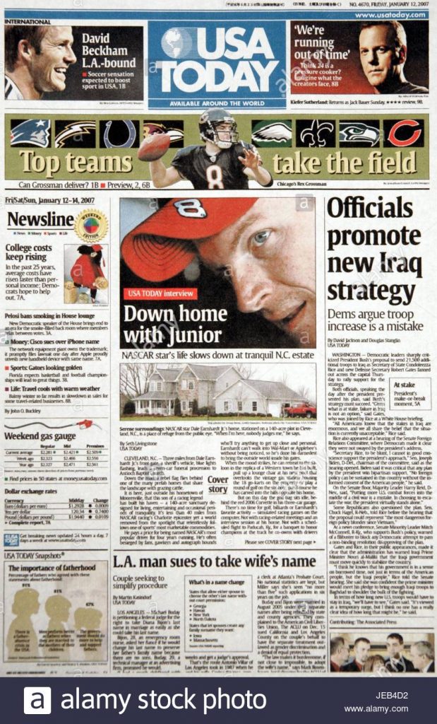
I just shared a link in our production channel and take a look at that. It’s an image. So that’s that’s a it’s a U. S. A. Today. Front page from 2000 and seven. It’s the paper. It’s a like a scan of the of the newspaper
right? Yeah
so like you have like the masthead at the top and then at the side it has like the it has kind of like navigational references like the money, sports life on the left hand nav like everything about like our web layout is like rooted in print layout. I don’t think we’ve ever let go of that. And actually this, I’ve never really considered this before. But this really makes me think like if print media had never existed how would we be designing web layout, what would we be doing differently?
What what got me thinking was um And we’ve we’ve already mentioned it now. I’m in the middle of redesigning the drunken new X. Website and so I’ve been thinking about our menu and our header and whether or not you know I want to do a sticky nab on it. And so I’ve been doing some extra research on on sticking ah but also on the accessibility of drop downs and things like that just to make sure that I got all the T. S. And cross all the eyes. And I’ve come to some conclusions.
I’m gonna save those for the end of the show and I’ll tell you kind of what I’m thinking at this, I want to first start with, you know what’s funny to me is if you look at some of the big players in web right now, like if you went to amazon dot com right now they don’t have a sticky header. Here you are at this great big you know Monolith e commerce site and we’re gonna talk about like you know sticky knaves placing in the calm but amazon does not see a need to give you a sticky nap. Uh which I found interesting. Um I was always thinking about new egg.
Same thing. Go to new egg. No, it doesn’t do a sticky name. Now, they do do a sticky, but it’s not the main nav and or we’ll get into this like they’ve done a sticky product nav, but not the main menu. So like when you’re looking at a product and you scroll down, the thing that sticks to the top is the navigation for the product. So you’re talking to reviews, product details, specs all of that that I found very interesting that isn’t a choice that was made that has, I think a very specific application, go go over to like take a site like, let’s let’s take something like MSNBC, big news site, right?
Big, main, major news player in the industry. And you look at their site and they have a knave that sticks briefly as you scroll down. If you click into an article and start scrolling, the masthead will stick to the top and you’ll see MSNBC, listen, watch live today all this, but as you scroll it goes away and then they stick a bar to the top that just has the logo, the title of the article and some share icons. And there’s a hamburger. I should. Yeah, there there’s a hamburger attach. It’s like like kind of
a mini miniature menu.
Yeah, there’s like a two stage sticky nav. Um Just it’s a very interesting design choice I guess. I’ll say like I don’t know how else to qualify. I don’t like it for what it’s worth. Like I I don’t I don’t like it. It doesn’t make sense to me what they’re trying to do there or why it’s valuable to me as somebody looking at a page on their site, lot of a whole lot of different ways to go about, you know, making these things.
So I want to talk a little bit about what makes sticky knaves a bad idea, what makes them a good idea and how that’s going to fold into my thinking for the redesign of our own site. Um you know and what that means, the bad, I want to start with the bad because the bad is easiest. First off, you’ve got to think about screen real estate, right? A sticky knave means you are committing a chunk of your view port in perpetuity unless you’re MSNBC and you take away part of the sticky, not arbitrarily ah you’re you’re committing a part of that view port to that navigation.
This is way way more true on mobile devices. My favorite is when you open an article on your phone and there’s a sticky nav. There’s also an ad at the bottom that pops up and then they pop up the subscribe modal on you and then you can’t see anything. And then there’s also besides just their navigation, they’ve also got a covid alert banner above that And so you look down at your phone and you can see, well four words so far that are relevant to the article that you came here to read. Like that is an infuriatingly bad use of space.
At that point you’re committing space and arguably the sticky nap is not necessarily the problem there. Let’s be clear about that like that. The real problem is the other stuff that’s not being considerate of the users intent, but it’s still something you have to be thinking about. You got to think about your real estate. Um, you go to top tile dot com. Um, one of their designer blogs, they’ve got a thing written. They say it’s a common uX mistake to go overboard and stuff.
The sticky knave header with content with a fixed header browsing should be comfortable for visitors failing to find the right balance may result in leaving a small amount of room for the main content and a stifling claustrophobic site experience for visitors. I like to think that we have all probably seen a site or this is a problem where there’s just no room. They didn’t, they didn’t allow any space for anything and you have to be conscious of that If you want to put this into real world numbers, if you think about a navigation, that’s only 180 pixels tall, that’s not big mind.
180 pixels is a pretty small chunk of space. But if somebody’s on like a an older laptop and when I say old, I mean like a couple years old low resolution laptop. Like a 7 68 laptop which is considered high def. Mind you 7 68 is an HD laptop that’s a quarter of the screen real estate more. If when you think about the fact that you have to account for the browser chrome too, you know Like that’s 768 total screen pixels tall and you’re committing a quarter of that and there’s a quarter of it committed to the browser chrome.
So you’re only leaving half of the browser height for a web page. Uh huh. It’s food for thought when you really think about how you’re using your real estate and there are a lot of 7 68 pixel tall laptops still out in circulation. You know, this isn’t like 10, 24 by 7 68 type resolution we’re talking about. So that, that’s a problem you have to consider. Um, and it’s, it’s not, uh, it’s not bad on its own. It’s bad if you don’t respect that real estate is kind of, it’s the intent. That can be bad.
The other problem, wisdom labs has this written about research, they say. Additionally, before you jump on the sticky bandwagon or any of the top trends, it would be best to get feedback from your users if there’s a common friction point that’s frequently encountered and if so how would sticky navigation address that, what tools, pages and features are most commonly used on your site? Do you need them on every page?
That’s, that’s a really good point. I think that’s probably would be the biggest driver for me. Is your site menu driven or is it content driven? Because a lot of times you use your interactions will happen within the content itself, Right, Rather than through the menu. But like with amazon I think like amazon, I would probably do like a mixture.
Like sometimes I’ll be like uh you know, click on an item and then I’ll see the related items and maybe interact with the content area a lot, and then I’ll be like changing topics, go back up the top, search for something different and then start again. Um And maybe that’s why they don’t have a sticky enough because it isn’t really needed
wal mart does mm walmart use their nav goes sticky. Um In a weird way as well, like as you scroll down, it scrolls away, then it pops back into view. It like, you know, if you stop scrolling it, don’t know like just as you’re scrolling, like as you scroll down the page of walmart, it goes away with the scroll but it really pops back in the view instead of just staying. Yeah, there’s an animation there that I don’t really understand but they were
if you scroll back to the top it remains the sticky knave.
Yeah, I I don’t fully understand it. Um But they walmart itself has committed heavily to search and so their their nav bar is very simple in that they’re basically saying here’s the search bar all the time. I do like that. I think that’s a good relatively good use of a sticky nap. Especially when you’re somebody again. E com that’s that factors in I think a lot more as opposed to us. This is one of the considerations that I’ve been chewing on, which is why would somebody need the drunken Ux website to have sticky navigation.
What is it about our Nav menu that would compel somebody to want to bounce to another part of our site and need to do it with sticky nav.
I can’t think of one. I think I I feel like for our site and I do actually use our site now and then usually when I’m looking at show references, I would think that content oriented Nav would probably be the primary interaction point.
So to compare again, I brought up new egg and to look at new egg the way that they’re doing it. Is that contextual awareness right? They have, they did their research and realized, hey, we don’t need the main knave up. There are people because you know, some of those spec pages can be really long. Especially the persons on the product page. The product is what is important to them. Let’s make the sticky element be the stuff that matters for the product.
I see that applying to us, if you open up a transcript, Yeah transcript is inside of a container to keep the page short when the page loads because there’s a lot of text in it. If you hit the button it expands down. Makes the page 20 times longer. So in that situation I can very much see as you scroll down, maintaining a a sticky bar that might have the audio player and like a back to links, you know, or back to back to um you know, notes type link there. You know, that would take you basically back to top type of feature.
Because if you’re a long way down that that transcript, it’s a long scroll to get back to the top of that point and there’s no way to re close it at that stage. Now I may do some other work there, but thinking about what, what does the user need from a sticky knave in the context they are in. And for me, I feel like that’s an easy answer for us. And for other, you know, I think that’s what new egg did and walmart kind of um, you know, walmart’s goal was a little different.
The other. Uh, one of the last two issues, one is there is sort of a risk of hostile design that comes out of this. The adobe XD blog has an article, they say, um, Daniel filler, he’s the experience design director at Capital One, he said, of course, with great power comes great responsibility. I’d ensure you’re providing visibility to these blocks in a manner that aligns with your customers unique needs, not just that of the business. Sure. It’s important to business meets its goals, but not at the expense of our customer experience that just propagates dark patterns.
This is just that idea of, hey, we’re gonna keep our head are up there because we demand your attention and we want you to keep clicking on other things even though you’re not here for those other things Now, I can’t think of a named dark pattern that that would apply to her or hostile design that would apply to.
Mm So it’s kind of like a, like a permanent interstitial, like nag nagging thing
maybe. Mm hmm. If anything, I could see it falling into like a misdirection.
Yeah. I think the hostile design risk here is something that’s maybe less of a hazard and more of a like don’t be an asshole kind of thing. Like you’d have to really go out of your way to make this hostel. Yeah, I could see inconvenient but like hostile I think would would you would have to really be trying.
I always, the one thing about hospital design that always gets me is is getting into these discussions of design patterns that are poorly articulated and geared towards a user versus things that are actively identified. So like when we talk about dark patterns or hostile design, like there are specific identified patterns, there’s a roach motel, there’s sneak in the basket, there’s misdirection, there’s bait and switch.
Like these things have names and and constitute an actual like qualify a ble unit and to just say like something is built in the interests of business rather than the user. That’s just bad. Ux. Like that’s all that amount Shoot to me like I wouldn’t call it hostel as an adjective to describe the intent of what’s happening. I just think it’s bad. Sure, so to speak. I’ll give you that.
Like if you’re like, it’s, it’s a, it’s an opportunity cost and you’re, it’s a waste of screen resource if you’re not actually needing it everybody and we’re just using it because it’s shiny
and to, uh, maybe to sort of go off of what I said when I say misdirection, you know, it’s, the design is purposely, I’m quoting dark patterns dot org. The design purposely focuses your attention on one thing in order to distract your attention from another this. So the idea of being, hey, we’re gonna keep the sticky knave up there in hopes that it compels you to go look at our about page, let’s say, because again, every site usually has an about page. Right? So that’s in, that’s in your sticky nav. Probably. And that, is that a dark pattern at that point?
No, but it can be if you start pushing on and that’s sort of the, I think the risk that’s being mentioned that that Daniel was getting at is it’s not hostile design out of the gates, but it creates an opportunity for it because now it’s like, well, let’s uh, let’s make the button animate, let’s shake the button to grab their I let’s add some little micro, you know, micro animations and things like that to uh, you know, draw people in or get them to do this or, or force them to fill out a form or whatever.
Like it’s just an opportunity to do that if you’re not doing it because the user needs it The other one. and there’s a good article over at Nielsen Norman Group about this. Um, they mentioned stocker menus and this was kind of a cool one. And actually the walmart menu almost qualifies as a stocker menu, but not quite because it does stay in view once it has scrolled in. It’s think about like it’s like a rubber banding effect.
So the example they give is with a side knave and this thing where you scroll down the page and the menu scrolls away, but then after you stop scrolling it steps back in the position. A
I’ve seen those before.
Yeah, so it’s like it’s it sneaks up on you so to speak, and that’s kind of what the walmart menu does when you first scroll away, but then it stays there. So it’s like, it’s doesn’t quite qualify at that point. Uh The problem is a it’s animation. Um animation can be an accessibility concern, but also it’s a distraction for the user at that point because you’re animating something that has nothing to do with them. Um and it could just stay there, like it literally can just follow the user down the page. There’s no reason for that behavior to be there at all.
The user thinks the menu is going away cognitively. They process that and mark that, you know, in their memory as to where the menu is but then boom it’s back in their face. Yeah. You know, bad Is it bad? It’s you know, that’s maybe subjective a little bit in that regard but it’s definitely excessive
I think objectively. You could look at it as is it preventing the user from doing something. But like I think if it’s disappearing and reappearing, I would see that as maybe it’s going to be able to, it’s going to be distracting. There’s sudden sudden change in my periphery and I’m gonna snap away from the content. I may be reading and see what just changed and it’s distracting. I don’t know. I uh, there’s a, there’s a lot of hostile patterns that are really dislike.
I feel like I, I don’t hate on this one too much. I, I do agree with you on the mobile side when it crowds the menu, especially when you have like ads and other shit on this in the screen. That’s a problem. Um, I like the sticky menus when they’re like really tiny and just at the top and it’s like basically just the mobile menu, but on the desktop. I don’t mind those so much. Those I think are helpful if it’s a menu driven site.
Yeah. So let’s talk about what’s good about them. So we’ll get, let’s get right into this whole idea of aecom and why that works. Content Square did some research. Um They said sticky navigation works best in retail, e commerce and other types of actionable sites where the designer intends for a user to take a specific actions such as click to purchase a product. Um they go on to point out that this also makes people feel like they are in control of their experience. At 38 of customers said when a website is easy to navigate, they’re more likely to shop there again in the future.
I just ran into this actually a website that didn’t have any kind of sticky knave because what’s what is one of the most important things that an e commerce site will usually put in their header. Your cart. Yes, yeah. The cart button, We have been trained to look for the cart in the upper right corner of most websites.
This site did not have that and I was trying to purchase something and I was switching between a couple tabs because I was comparing some products and I went back, I thought I had lost my car because instead of it being in a sticky nab up at the upper right corner, it actually was in a a fly out tab along the right scroll bar in the middle of the page.
Oh weird.
Not where I would expect it to be at all. And uh e com I think is a good example of that because you can put those. So with walmart, walmart putting the search up in that is big because if you’re buying one thing there’s a good chance you’re buying many things. And so if you want to get between products quickly searches frequently, the best way to do that, their cart is right in the upper right corner, like every site normally has it. So it’s immediate.
It’s there, it’s easy to find uh new egg using that sticky nav but not their main knob. It’s the product Nav that’s designed to be around the actionable components of that product so that you can engage with it, learn more about that product, inform yourself and decide if you want to buy it. It’s designed to facilitate your experience with what you want to buy. Content sites. Content driven sites don’t have that.
This is a little bit of tangent, but a long time ago is working on a hired website and we had just had a redesign done by our University Networks Creative Services department and they had this audience Nav and it was like students, parents and I think like community or faculty, like there’s like three different audiences, but it was it was a persistent part of the knave that took up vertical space at the top.
And I was like, why is this here on every page? Because if I’m a student, I’m not going to suddenly become a parent or a faculty person. So it should, it should be like something you choose initially and then it goes away.
The that actionable piece, right? That’s kind of what your, you know what you’re saying? They’re like, yeah, that’s not an action that I can take. And if, you know, students are one of your primary audience is it doesn’t make sense to give them actions. They can’t do run an e commerce site, viewing your cart is always an action that you can have in front of you at any given point That the other interesting side effects.
Um, so I want to copy out this, this research is from 2012, so we’re talking this is a decade old at this point, but it’s some of the better research that’s out there. And it also comes from Smashing magazine as it so happens. Um they said that fixed knave bars, save 36 seconds off of a five minute visit to a website. Shortens the website, visit by 22 by having that there. It’s kind of un intuitive. Why would it, you know, why would fix navigation sticky navigation shorten a visit?
They said participants were then asked whether one of the websites felt easier to use. Six of the 40, participants had no preference. But of the 34 that did have a preference. 100 of them indicated that the website with the sticky navigation was easier or faster to use. Mm. This this can get hairy if you’re talking to a marketer or talking to a sea level type person because they’re going to say why, why are you not keeping people on our website longer?
Right. Right.
Keeping people on your website should never be a goal. Ever
pay. Remember when it was like everyone wanted your website to be the one stop shop, they’d be like, oh yeah, put the weather widget on their
yeah,
let’s put a chat function. Why not?
People will stay on your website as long as necessary to complete their task if that’s reading an article, If it’s an eight minute article, I would hope that page has a six minute time on page. You know, something reasonable. But keeping somebody on your site is just as likely a sign that you have bad Ux as it is a good UX. Because it’s a one dimensional metric. I can’t give you a better piece of advice about analytics except that one dimensional analytics are useless. You have to put them in context.
And if you can shorten somebody’s time on your site while also reducing their time to convert mm That’s good because it means you’re doing things efficiently. You’re doing things right. And as the smashing magazine research says, if they can do it better and faster, They’re more likely to come back. 100 of the time. Like that’s no small ask at that point. Like that’s that’s like to have something come through. Conclusively 100 is a rarity at that point. But people equate speed with efficiency and with quality,
they
don’t want to be on your side for five minutes because they are going to feel like they’re hunting, they’re going to feel like I can’t find what I need. There are a million reasons. Somebody maybe on your site a full five minutes and most of them aren’t good,
but having
what’s
your youtube.
Well, but yeah, again that’s a that’s a pretty different use case at that point. Like obviously there are exceptions to any of this, but that’s why I say that the stuff of that Content square was saying, you know, making things easy in the right context with something like e. Com is a huge deal. Make it easier for people to shop. They’re more likely to shop again in the future. Make you know, give somebody the tools they need, where they need them and lo and behold you get good outcomes.
Like it’s actually a pretty straightforward principal I think for the most part. Mhm. So what does this mean for drunken you x I think what I’m a do and I’m not sold on this yet. Especially because of the second thing that I’m going to say, but I may go with the partially persistent sticky nav.
Which one is that? Is that the one where it’s like the little mini, like the hand of the hamburger menu?
No. Um and Nielsen norman has uh, this described in their article, but it’s the kind where when you scroll down, the menu goes away with the page and you scroll and you read because the idea is if you’re going down the page, you don’t need your navigation because,
but if you scroll up, it reappears
right? When you scroll up, that is an indication that the user wants to return to something wants to backtrack. And so you show the menu when an up scroll happens and then they start scrolling down again. It goes away again.
I’ve enjoyed those.
That is a marriage of sort of the best of both worlds kind of situation because it gets it out of the way. I remember when I said, you know the respect for space you stay out of the way if you actually go look at your browser on your phone in particular like Chrome um Safari, That’s how they work. It used to be that that browser chrome stayed on your mobile device. And now, ironically, you know that our phones have gotten bigger screens have gotten better.
That chrome in in the mobile browsers goes away and it comes back if you scroll up so that you’re so that you can commit your whole phone screen to the thing you’re eating. So it’s literally following pattern at that point for what people expect on mobile devices. So it’s it’s a pretty good use case. It does operate on the assumption that, well does somebody scrolling up actually want your head or back? Maybe? Maybe not.
Like that takes some research obviously, but it’s like a it’s a compromise, so to speak, at least gives them the option and it gives them a way to get rid of it easily without having to click something. Uh, the automated part of it is I think part of what makes it valuable, like, oh, I don’t want that many. I’m just gonna scroll away from it and it goes away. I don’t have to click a button. I don’t have to tell it anything.
Going back to the hostel pattern thing from earlier. Even though I don’t think that sticky menus are specifically a hostile pattern. I think we can still apply the hostel pattern razor to it. Which is that when when you’re considering should have put a sticky menu on my site. Think about it from the perspective of what is this making it easier for my user? What? Like what how does this benefit the user in the same way that you would like if you’re doing a hostile pattern approach or something like you should be asking yourself, is this benefit in the user is benefiting me?
I mean, I’ll reiterate what I said like a sticky header is not hostel design, like not not on its own, it’s just not the default state of it. Is that it would just be bad design which isn’t hostile, it’s just bad. It’s unnecessary. It’s excessive. It’s extra you know, like it’s all of these things but that doesn’t make it, it doesn’t fall into a hospital design pattern unless you employ a hospital design pattern in it. If you put misdirection in it, if you you know, if you’re putting I don’t know, pick one.
Uh if somehow you managed to put a roach motel in it, I don’t know how you uh you know, friends spam could be built into it. If if there was some kind of like The Nag to share, right? If if you had a like that MSNBC one Not quite that, but the MSNBC one since share this is prominent on those pages, you maybe could argue that it’s bordering on friends share hostile designs. So our friend spam rather the thing I’m almost certain I’m going to do though is the one I did talk about which is sort of a context aware sticky.
I do sort of like the idea of if you if you’re looking at an episode page and scroll down, our main knave isn’t sticky but you do get a show nav that stays sticky. That let’s say we don’t get a lot of listens through the website. Most of it comes through actual podcast players, but there is an audio player on the site and if you are listening to it there and are scrolling through the transcript, I think it would be nice for that player to be stuck to the top with, you know, a couple of links to go back to the show note links and to go back to the description or something like that.
Like that makes sense. It’s useful in context of what the episode pages do. I think people will use it. No, not really. I think it probably would not get used at all but it at least makes sense and it is actionable within that context of why you would be on an episode page. Mhm. At that point, so that’s where I think I’m gonna go with it. That’s all I have to say about sticky headers. I’ve been thinking about this a lot lately, I’ve got all kinds of clickable drop downs accessible dropdown sticky headers, partially hidden headers and all of these things on the brain right now.
So I thought it’d be fun to just kind of talk about and go through, go check out the show notes, several links in there, including an article from web Designer Depot that has uh some interesting examples of sticky navigation. Um I mean they they said uh 12 fixed sticky now bars that will grab your attention, I will say that is true, but not all of it in a good way. I looked through all of them and yeah, they grab your attention sometimes. Better or worse. Yeah, yeah,
yeah, So I think this is episode 86.
Listen, I can’t be expected to count every week. Mhm. I maintain show notes for a reason And if I put the wrong number in there. But you know, the real thing is we move stuff around too, so let’s just pretend like this was originally episode 85 and code reviews just got stuck in there and we said, let’s do it first. I don’t know man,
I’m not being critical man, I just clarify
that show numbers. How’s that?
These colors?
This is,
this is magenta,
fuchsia, this is the future episode.
Well, if you want to give us more color names for our future episodes, you should come and tell us on twitter and facebook’s when facebook’s that come comes back up again. I guess it was down today.
It’s back. Uh huh.
Uh So I struck a new X and instead giggles dot com. So I struck a new X podcast and come and talk with us and name all the colors you like in the colours channel on junkanoo X dot com. So I should discord
and think about, you know, the, I think the takeaway the golden nugget of this episode is this idea of if you think you want to use a static head or be sure to be considerate of your users, understand your users goals on your site and, and the worst case scenario, do some user research on it. Um, mock up some stuff and get on twitter and have a few people look at it, you know, jumping our slack.
I’m sorry on our discord and ask us to look at it. Like go out and do a little bit of research on that. Um, what was it erin that you’d set a while back right in in one of the books that you only really need a small sample size to get a good view in some cases of like simple tasks,
Steve Krug says like that crew five Yeah. Don’t make me think. He was saying in his testing isn’t user testing isn’t rocket surgery.
Uh,
He said 5, 5 users your five user test will give you like 80 of the issues
and that Yeah, yeah, not perfect. Obviously, if you want a better picture test more people, no big deal, you know, do do what you can do, it fits within your budget. Because when, when you get that information and you then try to figure out what you’re gonna do about that header, you can be certain that across the board you have kept your personas close but your users closer er er thank you, tip your waiters, Bye bye