
Aaron returns for this week’s episode, where we take a look at Facebook’s FB5 redesign. While the new look and feel brings a much needed refresh to an aging layout, it’s not without its issues. Strange choices in whitespace responsiveness, mystery meat navigation, and confusing notifications give as an opportunity to question the usability of the new design, and discuss possible solutions.
Followup Resources
Firefox to Block Notification Spam (2:55)
- Firefox will automatically block website notifications in 2020
- Reducing Notification Permission Prompt Spam in Firefox
- Using the Notifications API
Facebook’s FB5 Redesign (15:23)
- Facebook’s “FB5” is cleaner and Groups-centric (but not much more private)
- Facebook experiments with a new design on Timeline, tries out color wheel option for Instagram too!
- Facebook shows off major redesign coming to iOS and desktop including dark mode for web, Instagram getting new ‘Create Mode,’ more
- Fitts’s Law: The Importance of Size and Distance in UI Design
- How To Design Notifications For Better UX
- Myth #28: White space is wasted space
- The Noun Project

Giant whitespace columns on widescreen monitors 
Whitespace under left navigation 
Recent/Top Posts sort toggle that vanishes 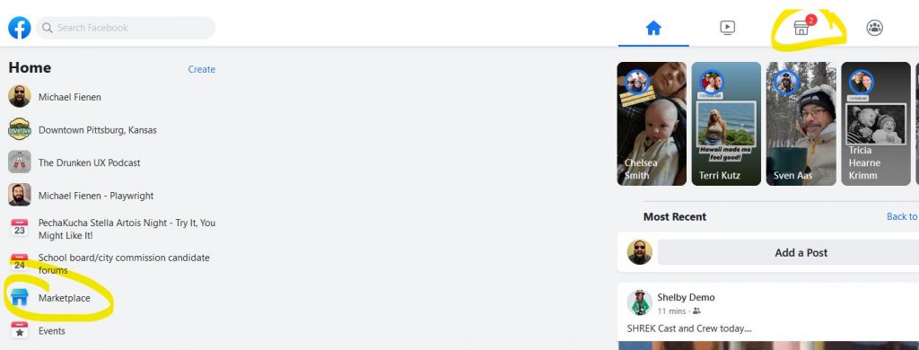
Marketplace link duplication 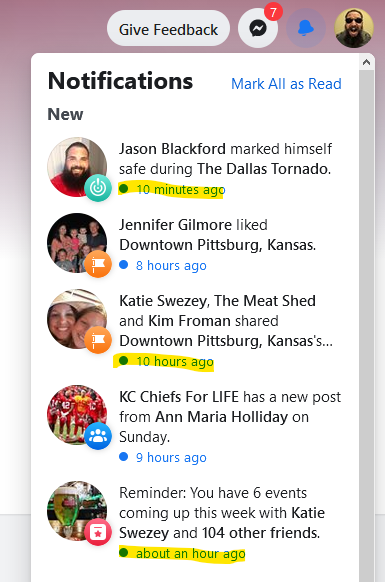
Notifications not sorted by time
Transcript
The following is a machine-generated transcript of this episode. It will contain errors until it has been reviewed and edited, and we apologize for the difficulty that may cause for screen readers. Do you want to help us speed up our transcribing process? Consider sponsoring an episode.
Hey, everybody, you’re listening to the drunken UX Podcast. I am your host, Michael Fienen. I almost forgot my name there for one quick second. But I made it and you heard a laugh. And that means that I have somebody joining me again this week. I’m Aaron Hill, and I’m your other host here. You may remember me from Episodes past from such episodes as other one.
The one where I said something bad.
Folks, you’re listening to episode number 49. We’re going to be going over some UX impressions of the Facebook redesign that is starting to roll out this is FB five as it is being called in certain circles. Let’s see. Yeah, you said you got a cold. I’m yeah, I’m sorry. I if I sounded a little stuffy. This week. I’m a little, I’m a little nasal. And I can’t help but I’m gonna try to power through though. Folks, if you are enjoying the drunken UX podcast run by our sponsors over at pork bun, bun, check them out at pork bun. com, you can get a free year of a design domain name, just use the coupon code drunken UX. When you check out and go see, get yourself a new domain. I need a new one. I let two of them expire this week. You know what it’s kind of freeing to watch a domain expire and just be like
you know, it’s true. When you let it domain go. You no longer have to have it in the back your mind. I should do something with it. Yeah,
yeah. I’m trying to buy into that do less better mantra. It’s like yeah, I don’t need I don’t need to think about doing something else that I don’t have time for. So outside of that, be sure to check us out on Twitter or Facebook. You can catch us at slash drunken UX. We are on Instagram slash drunken us podcast or you can hop on and to chat with us on slack. Just go to drunken UX comm slash slack and that will feed you right into our little handy dandy invite system. We let anybody in I let Aaron and tell me about what you’re drinking.
I’ve got a got a coffee here with the stuff in it. It’s tech. It’s technically coffee.
I’m a pre gamed a little bit. So I had a glass of scotch but what kind of Glenn a team based nice go to for me? I guess the I should have said that. And but then I followed it up with a glass of Stella Phaedra. Oh, Oh, nice. And then I followed that up with a shoddy agar. You’re just covering all the bases. So did you get bingo yet? We’re gonna see how this goes. Okay, so first and foremost, I want to talk real quick. So last in last episode, We talked briefly about the update that’s coming to Chrome where they are going to start blocking mixed content on HTTPS pages. Very, right. interesting idea, very cool way to kind of force people to do better. And you may like it may not may cause some folks problems. I have no doubt. But Chrome is not alone in saying, you know what, we’re going to start forcing some stuff on people.
It’s very apropos that we would be discussing this browser with this feature today, given elsewhere talking and
it also true. So Firefox has announced that they did some research earlier this year, and they plan early in 2020 to start blocking notifications, spam in the browsers.
Nice. I love that. Yeah. So this isn’t always a decline anyways, but
right then, and so I’ll mention here a second. They did some research on that as part of, you know, the backup for why they’re doing this. Basically Firefox I feel like over the last year and a half or so Firefox has basically said, it’s time for us to be everybody’s favorite browser again. Yeah, they they came after the developers first by the, you know, they put in a ton of work into their dev tools, their sandbox tools, all this accessibility tooling was lightyears ahead of everybody else for a while. And so developers slowly started coming back to Firefox to make use of this. Then they started saying, you know, what, we’re going to start putting an emphasis on privacy and, you know, the, if you’ve used Firefox recently, you may be familiar with the Facebook containerization that they Oh, I
love it. That’s the whole reason that I, I use Firefox pretty much exclusively now. And I, it’s predominantly for that reason.
I am almost a complete convert back to Firefox again, because of a lot of this. Now they’re working on trying to beat Google to the punch at blocking notifications. Google is working on this mind you Yeah, but it looks like Firefox is going to get their version of it out the door ahead of Google. We’re currently on version seven, the Firefox. And by version 72, which they’re saying is early 2020. They’re going to be releasing in a limited fashion functionality that basically doesn’t block notifications, like you will still be able to agree to browser notifications. But they are going to be hiding them in a way that when you visit like CNET, you’re not going to get that pop up right in your face to Bry. get notifications or whatever. When we talk about notifications, what we’re talking about is like, we want to send you updates. You know, when we release new news story, we want you to allow us to use your location, we want you to allow us to use your microphone and your camera. It’s this whole browser API that exists now for notifications. And it’s a great tool. It’s a great resource and the reason that exists is because browsers wanted to develop features faster than other like JavaScript and web API’s could allow. And this was a means of getting that functionality baked into a browser, but gating it so that, you know, people had to opt in. problem being, of course, it really gets in your face over time.
Yeah. I remember thinking it was really cool initially with like how, like Slack, for example, you could enable desktop notifications. And that was kind of the first time I really started to see this feature come out. And it was like, Oh, that’s kind of cool. Like, I don’t have to have a separate app installed. I could just use the browser. Nice. But then like, everyone started doing it. And I’m just like, oh my god, stop it off the stop. Know what I don’t want it anymore.
It’s it’s the kind of thing where it’s useful in a very limited capacity, right? Like there may be one or two sites that you really do want to get notifications from. But if you’ve got a dozen of them, two dozen of them Um, it’s so spammy at that point that it loses its usefulness to you.
Right?
All of these sites that are out there want you to allow notifications and be alerted. You know, it’s it’s basically the weaponization of RSS. If you want to think about like RSS was perfect, because I request it, I put it into a tool that lets me go into it and get it. But I still get that trickle of your content on my demand,
fully weaponize desktop notification.
What Mozilla did, and we’ll have some links in the show notes to this stuff. They started testing this back in April of 2019. And they started collecting telemetry on all of the notification usage to figure out how are people using them? What were the use cases? What was their interaction like? I’m going to just read a truncated excerpt from this that said that the notifications prompt is by far the most frequently shown permission prompt That’s, you know, when we say that, again, that’s compared to microphone that’s compared to location. Not even 3% of these prompts got accepted by users. 19% of prompts caused users to leave the site immediately, in stark contrast to the camera microphone prompt, which has an acceptance rate of about 85%.
Okay, it is this is the tragedy of Commons for the attention economy again, just like we saw an email, everyone thinks like, Oh, I’m just, it’s just my little site, I’m just going to ask for to send notifications, or I’m just going to send you just a little email here and there. And, and nobody considers that every user is going to be getting email notifications from everybody else, because everyone else has the same attitude. Yeah. And we only have a finite amount of attention. So it gets worn down really quickly, right, but like, but by comparison, the camera microphone prompt, if you’re going to a site that’s prompting you for that, you probably want, you’re probably there for that reason, like you’re at hangouts or whatever other toxin teleconferencing product, do you want to enable that that
and even to an extent the location API? And I say to an extent because, for instance, if I go to Home depot.com, and it wants to use location API, I know it’s using location API, because it’s going to locate me to my, my area or so they can show me stuffs in stock. And then you go to sites where that doesn’t make sense. Right? Where like a news, a new site, right? When, when a new site or you know, a music site, I had a music site, do it to me one point, you know, Astro location, it’s, you know, very strange and kind of out of place. And even when we talk about notifications, if I’m going to a news site, and going to a new site to read the article. Yeah, and then I’m probably going to leave because that is the transaction of the relationship I’m intending to have. I’m not going to stay on the site and read 12 articles. Probably
This gets back to which episode it was the weather one or the e commerce on, we were talking about how when a site is adding a feature because it helps the people the business running the site, rather than a feature being added because it helps the user, right. And then in this case, like, you know, like the Home Depot example, you mentioned, that helps you as the user, and it facilitates the experience, but just adding it because it gives them better demographic data. It’s like fuck you, man. But no,
just because I go read one article on your new site. That doesn’t mean I want to get every article you write in perpetuity. Right. And the the big part about that, right is that these notifications are entirely opaque. You don’t know what you’re going to get, and how frequently, you know, if you think about a site like, you know, NBC News, or you know, they put out dozens and dozens of articles today. I don’t want all of those notifications. Right and As a developer, you’re limited because you can’t change the browser’s wording of that, right. You can’t say, Oh, hey, get notifications for this. All it happens is the browser pops up the little icon. And it just says, Hey, do you want to get notifications from the site? And that’s not useful. It’s, it doesn’t give any information. So like in Firefox, the exact wording, will you allow www.cnet.com to send notifications. And that’s it. I got doesn’t tell me anything about the notifications I intend to get,
right? Like what kind or what they’re going to do with it. And
even if I want those notifications, if I hit allow notifications, it’s difficult for most users to understand how to disable those notifications once their pipeline in Yeah, it’s not a hidden feature or anything. It’s just not intuitive from the user. standpoint, because it’s a system level feature. It’s not a web page level feature at that point. Dear Firefox,
if you’re listening to this, please add little chrome controls where we can enable or disable these API tie ins easily. That would be super cool.
And if you look like so thank you for listening. If you look here at the, and I’m screen sharing with Aaron right now, for anybody who is wondering when I say look here, in the bar, you get like the little, the little icons up here, right? And you can click them. Oh, yeah, yeah, pop up. And then it’s like, okay, here’s your secure connection. And and then here’s the permission section. But like, these icons don’t look like anything to a normal user. Otherwise, like, there’s no invitation to click on them or anything. Right. And so it’s it’s just one of those things. It’s obfuscated just enough as the user that if you have opted into them, that opt out process is a little tough. Yeah. So at any rate, Mozilla ran these experiments. They did a couple of them back in April. They’ve got the run. ports up, we’ll have those links in the show notes very interesting to go through and look at and read about and see how people are using those notifications. And it’ll be interesting to see what the outcome of it is from that standpoint, because it’s, it’s just curious to see browser manufacturers say, Hey, we’re going to do this whole notifications API, so that you have access to these new features. And then they realized, wow, people are abusing these features. So we’re gonna, we’re gonna lock those down and make them actually harder to get at. But
at this point, I, anyone who says like, wow, I’m, I’m surprised and it was unexpected that these people misuse these features in this way that was profitable for them, like know, at this point, just assume, if you allow, like a browser to do literally anything that it’s going to be exploited.
You know, I think the thing about it is it’s not even that it’s being abused, necessarily. It’s just that it’s so much. It’s like the privacy compliance stuff and the cookie comply. Yeah. It’s the volume of now. Every time I go to the sites, I constantly get a cookie pop up, I have to click the thing how to do this stuff. And I have to do it so much. It’s good for. for it. It’s it’s the right thing to do, certainly, but it definitely creates a saturation experience that is unpleased. Yeah. to the user.
Well, and the other thing, too, is like, I am not prepared. If I go to a site just to read an article, like, I just want to look at a news article. And now I have to decide like, wait, what except cookies. I Dude, I just want to read the article. Like why do I have to make this decision about whether or not like, you know, you’re tracking me like, are you just tracking which stories I’ve read? Like, what’s the point here? It’s very vague. Yeah, but let us know.
What are you using browser notifications? Which ones are you using? I’ll be I’d be interested to hear how people are making you so
I’d like to know also, if you’re going to consider dropping us a line or have you switched to finally have you used the new Firefox and which do it and what what features do you like about it like for me like the the Facebook blocking thing, was like both awesome and also like holy shit like every fucking site. Like a little gate thing pops up every day. It’s like well we’re blocking a Facebook beacon attempt is like really?
So speaking of facebook,
facebook ox is our next
Yeah, this is kind of an interesting deal and if you follow me on twitter I’ve talked about this a little bit so you may have heard me already complained about some of these not going to be complaining. I will point out how silly and weird some of this stuff is, but we’re also going to kind of offer some you know, options for how you might address this. What happened is starting back in early April, Facebook started rolling out FB five, FB five is their latest redesign to the desktop experience. I think it also included like the mobile app though i by this point, I think everybody has the new mobile app experience for the browser. It’s been in beta. And like, I got access back in October. I know a lot of folks still don’t have access to this yet. They still see the old Facebook, I saw the old one. Oh, you still have Facebook, I figured you got rid of it.
I know I, I do still have an account. And I do check it occasionally. I used I would have the app on my phone. I just checked it through the browser. And I actually can’t click I can’t share posts anymore. It always tells me that it gives me like 500, basically. So I just basically just read, you know, read the random things that my friends post every now and then.
So and I’ll throw some screenshots in the show notes if you go by drunken UX calm after this, just so you can see if you haven’t seen this new layout yet you’ll have access to get a feel for kind of what it’s like. The short answer is, what they have done is they’re basically We trying to unify their design experience across mobile devices and desktop. So if you’ve been using the mobile app, when you see the new design on desktop, it’s going to feel immediately similar. The navigation style is identical with the five buttons at the top, the emphasis on stories right at the top, then in your feed, like all of that is going to feel very similar. The iconography is now unified across all of them. And, quite frankly, I will readily admit that you know, the old Facebook design was starting to feel very dated. Yeah, it’s been around a while. The icons in particular, I don’t know why specifically call that out. But like, the, their iconography and stuff they used in the old Facebook design was just yeah, it didn’t feel new. It felt about six years old, and I think they probably were about six years old. So yeah, so we get the same design. layout, we see the similar feed styling. But I also had an immediate reaction to how this works. So what I’m doing, I’m sharing my screen, Aaron does not have access to the beta yet. So I’m sharing my screen with him all we talked about some of this, and we’ve looked at it ahead of time as well. So you’ll have some flow here. But I will like say, I’ll try to include screenshots of some of this stuff as we go. But I want to talk about some of the decisions they made and why they seem weird.
Okay, before I know what our first topic is here that we’re talking about. But my first reaction when Michael showed me this little bit ago was why. So if for those of you who have been in the web game for a while, even if you’re not as a developer, just as a user, you may remember in the early 2000s, the period when we were transitioning from like, smaller screen resolutions like 800 by 600, or even 640 before at for some people up to like 1024, or even 12 at width and How the design that the design problem was okay, well, how do we make a layout that looks similar experience at different viewport sizes? And the solution was, okay, well, let’s put everything in like, you know, three column layout, and have it aligned to the center of the page using margin zero auto. That was like the fix. What Facebook did here is it’s like, you have the main center channel column. And then you have on either side of it more than that much width of white space. And then on the wings of the page far, like pushed up against each of the sides is like two more of the content console, like a messenger West and the other side is like, page sections, events and whatnot. But it’s just like this problems been solved already. Why are you doing this? And
it’s, I in my defense, I am one of those monsters who runs my browser full screen most of the time. I am on a two K monitor. So yeah, actually make it not full screen. What’s it look like when it’s it shrinks down exactly the way you would imagine.
Okay, okay, that
doesn’t look, that doesn’t look as bright. It definitely is a function of how wide you want to make your screen.
Yeah, but they but they could have satisfied this if they just like had if they didn’t do justify space between flex assuming that’s what they’re doing there and instead did like, I don’t know, literally anything else justify content center so
yeah, so to kind of just start running down this this white space problem right first and foremost This is what happens when you have a mobile first design that’s brought to desktop without really any consideration for those impacts. It I said it first thing if you use the mobile app and you see this, you’re going to immediately recognize it and it’s going to seem somewhat familiar to you, but bolting on the sidebars and letting them just fly out to the far reaches is definitely a consequence of them saying, well, we just need to put something there. And that’s not a great experience. And it makes me to do a real throwback here. It makes me long for the Google Plus feed.
Yeah, that’s the reminded me that earlier that the masonry
Yeah, remember masonry when that was like the thing. So you would land on Google Plus. And what they would do is based on how wide your monitor was, your feed might be two columns, it might be three columns, it might be four columns, and they use masonry grid layout to bring in all the stories and posts and tile them in there. So that you had your whole screen filled with with content. Now, I’m not saying that as that’s a good approach to this kind of content. Actually would argue that it probably is not at all a great approach, but it was a little weird, but this is like the complete opposite of that. And not in a good way. It’s like now I’m left with all this space. I’m just like, use it for something, give me some actionable thing that I can do with all of this space that’s surrounding my content.
There’s all these vestigial choices that were made to make it mobile friendly. For example, the content blocks, you know, you have the author, and then you have the content. And then if there’s a photo, they have the photo there, and the underneath that it’s like the who likes this, and then under that, it’s still like the interaction controls like comment, the comment, feed, etc. They’re all like vertically stacked top to bottom. Because on a mobile, you don’t have a lot of horizontal real estate. But on desktop, it’s the opposite problem. So why are we still using this way as a vertical layout when we have an abundance of horizontal space,
and if anybody wants an example of that, think about how Instagram does it on desktop, Instagram on your phone, Zach was all linear, vertical linear, but if you look at a post on a desktop, it stretches it out. You get your image on the left, you get your Comment section everything on the right there. And you could do that in a way that it’s still linear eyes as well between narrow and wide screens without like having it be extra layout. There is an I want to make sure we acknowledge white space is a good thing. Yes. Oh, yes. Yeah, white space is a tool. It is a feature in some cases. When it is done right. There’s an article will link from UX myths that goes over this, they have five points then talk about making white space work for you. And let me read those real fast and just think about them. When we talk about half of this page is white space. One right allows for easier readability and scalability to prioritises user interface elements, three guides users on the page for can create the feeling of sophistication and elegance. Five is essential for a balanced harmonious layout. And I would argue that this is not doing any of those five things. fails, but you’re not making what’s making design better maker white space where it’s not readable or scalable because now I’m forced to yet it’s the Fitts law, right? That the time to acquire a target is a function of its distance in size. And so now I’ve got elements on the far left, I got elements on the far right, and it’s it takes effort. And there again, this pan, they’re not,
they’re not bigger. Like, I mean, the distance, there’s a huge gap of white space. And then the things on the left and the right are the same tiny size that would be normally. So it’s not like they’ve been made larger. And so the distances easier to get to it’s just the same as it was.
And I think the all that like the use case that’s better than this is to look at Twitter’s redesign. And Twitter had a very similar redesign and that they went to make their website feel much more like their mobile app that has a much lighter looking experience. They have, you know, improve the sizing and scale of elements, but they did the opposite. This they did the thing you were talking about Aaron they brought in, they squeezed stuff together in the middle. Yeah, still have white space on your edges. But I think having gutters is having gutters on the sides is such a different thing from having gutters, literally taking up two fifths of the middle of your page.
When you have the cutters on the side, I mean, just think about if you were to it’s a perspective thing, like if you were to draw something, and you wouldn’t make it look like it’s coming out at you, you put the thing in the center of the layout. And then on either side, you put, you know, the white space to kind of suggest that there’s a background back there. And the thing in front of you is in the center, and it’s big because it’s close to you. So it visually creates kind of a multiplayer effect. Whereas what this what this looks like is you have three things coming at you. And then the background is somewhere else. So it’s just, it’s just it’s confusing. There’s there’s no visual path for this.
Use white space. Well use it to him. Besides your elements, use it to make the flow of the page feel nice and l like that the phrase from UX Miss elegant, or no, they said, Yeah, elegance was the word they used it use it to draw attention to things that require attention drawn to them. You know, this, this feed is super narrow. Just to look at it. When you look at this on a to K screen, you’ve got this whole middle section that is coming up like what is it barely 600 pixels wide, not even 600 pixels wide. Yeah, it’s pretty narrow, pad it margin it make that bigger, that you have the space at that point. So there’s no reason to not suck that into some of that area so that you feel like your space is being utilized. Find a way to bring content in but don’t just leave it empty because you don’t know what else to do with it.
I I’m going to say that I I’m going to give them three months. Well actually will say tomorrow Next year, I guess it’s about five months. I I’m thinking that they’re making kind of a lateral and economic orthogonal shift to have like a similar experience to what they had before. But with a totally different layout, because like the way that their HTML was like schemed out before it was pretty bad. So they probably had to get that layout pretty hard. But I’d be interested to see like in March, like, I’ll give them till then something’s gotta be different by then they’ll have to do something else with this new way out.
So with changes to outcomes, changes to the feed. Yeah. Now Facebook, Instagram, Twitter, take your pick all these folks, you know, they’ve started emphasizing this idea of showing you the important things rather than the most recent things. And you know, that that’s been its own debate, certainly amongst people. I’m somebody who subscribes heavily to the most recent approach, mainly because I don’t generally care about what happened eight hours ago or 12 hours ago or whatever. Right, I look at the site and I’m like, I just want to know what’s happening now. And then I’m going to move on to my next thing, that’s me. And for other people, other things work better. I’ve gotten used to the way Instagram works. So it’s it’s not that I can’t adapt to that. One of the problems that I’ve I’ve had with feed sorting in the new layout, they’ve basically buried the ability to change. This used to be over on the left, on the left hand side and that little nav bar, you could click a little down arrow, and you’d have the choice to sort by most, you know, most recent, most popular, and I noticed when I came to my feed, I don’t have that. Now, what I’ve noticed is I can’t change it. But I got confused because as I played with it more, I didn’t figure it out. And it’s a super bizarre contextual choice. If you come to the Facebook homepage when you’re logged in, or you reload the page, at the top of your feed, it will tell you your viewing most recent and It’ll say back to top posts, and there’s a link there. If you proceed to do anything else on the page, and then go back to your feed, it has now switched you to top posts. And it takes away that option up at the top that says you’re viewing most recent or most popular, or top posts rather, and go back to the other one. It just vanishes even though I’m now looking, I’ve gone from landing on the homepage to say looking at an event going back to the homepage, same context for me as the user. But now less options. That makes no sense to me at all, except that I know that Facebook is really trying to push their top posts algorithm,
you know, they have all this for this horizontal white space. Why don’t they just like do like your normal feed on the left and then like a very, very brief rundown of your top posts on the right.
That’d be interesting. Yeah, throw something in there that you know atrophied of some kind? I don’t know, I, this is one where I mean, the only suggestion I would have is to just not take it away. Yeah, like that. There’s no reason whatsoever to make that choice to say, yeah, we’re going to take that off of off of the feed when the user comes back.
I don’t mean to be cynical, but I think this gets back to the thing that we should always remember is that we are not the users were the product. And the product, the users are the advertisers. And so they’re going to show us the feed in the way that makes them money. Yeah. And not the way that we build the show is just enough to keep us from leaving this. And
as a consequence, this is basically them trying to wean us off of that. I mean, that is definitely what’s happening. But yeah, I mean, we know from research and from experiences on other platforms that people want recent, that is a function they want, and I’m definitely in that group. Yeah. navigation. Let’s talk navigation. While we’re looking at this. There. There are two main elements you have a main nav on top and aside now on, obviously, the side, the side nap or let’s let’s look top that first. Top nav is easier. First off, Facebook lets you customize a lot of stuff. And we’re going to talk about customization. So with the side nav in a second, but knowing that we can customize things Facebook knows what we use Facebook knows what we interact with the most. There are five nav elements at the top of this page. They’re the same on the mobile app as they are on the desktop app now,
home. Okay, wait, wait, wait, let me see if I can get home home is the first it’s pretty obvious like a house. The second one I’m guessing is video.
Good enough? Is that what it is? Watch, watch. Okay, watch a video. Yes.
Okay. The third one, it looks like a storefront with a notification. I’m guessing that some kind of mark Facebook as a marketplace is marketplace. Okay, and then the next one. It looks like the icon of a person with the people behind it I’m assuming that’s groups correct. And the last one it may be like a maze or Tetris piece. Is it a puzzle game? Wow
I am I’m genuinely surprised you got the last all of you you went right to what it was I didn’t expect that
I wasn’t completely sure on that one and just to be clear like Michael didn’t coach me this beforehand that was a legitimate
I’m kind of surprised actually that you got to have those certainly marketplace. I don’t feel is anywhere put $1 sign on our side. Yeah. Should be hard. Something like that. Yeah, gaming. Put a controller there. But you know,
yes. Or literally anything except
it’s like a it’s incredibly IL and those Yeah, those are not Tetris pieces. Like those are not the shape of Tetris pieces.
No, I mean, it’s like if you zoomed in really closely on like the LPS in a Tetris game, like it’s just part of it. That’s all you see. They could have gotten this amount project go look at that look up like game is unknown. Yeah.
So that’s one problem. That is not the problem that I have, quite frankly, iconography is an issue. Um, the the real problem I have with this is that I never and when I say never, I mean, through and through, I never click watch and I never clicked gaming. Yeah, why can’t I get events? As one of those are calendar? Yeah, you know, why can’t I get anything else up there, the messenger button something, something that I actually use the Create button, we’ll talk about that in just a second. put anything up there and do it based on my interaction, or at least let me change it in settings or something like that. Let me go in. And I can, you know, decide what I want for me because it is social media. It’s about my experience, and it’s about my engagement and they’re smart enough to know how to do that.
But the thing that you’re forgetting though is four of the well three of those five things, make them direct money. Groups is arguable. Like whether that makes the money but like watch marketplace and games. Makes Facebook.
You are entirely correct. Yes. Yeah. So it’s Yeah, it but again, UX isn’t about business you know UX is about users I
agree with I agree with you. And I agree that we should be able to change that and that’s something I would like maybe FB purity can swap those icons around or
something. So that aside now let’s talk side nap now because this is the one where it gets super gnarly. So left or right, the right isn’t really nav the right is just the messenger and contacts. So okay, the right bar is pretty much throw away for the most part, but the left sidebar super interesting. That first and foremost, white space is an issue again, but in a different way. We have this bar And over half of the bar is empty on the bottom. Right, which is a very strange choice to make. I think when you could put anything in there at that point.
What happens if you see some like unexpected down arrows? What happens if you click
right? So he’s looking at a couple of my personalized link. So I’ve got a couple like the drunken UX podcast shows up there. So if I hit the down arrow, it takes me into the page. Oh, what it does Okay, that was not what it doesn’t expand anything. Fuck. But here’s what you want a real a mind bender. You see Jacobs law, right? You see my face up here at the top where it says Michael Fienen right under home, Michael. Yeah, that’s me, right? If I click with an up, I click that what happens? I go to my page, right. But there’s an up arrow next to it. What happens if I click that?
I don’t know.
What? It’s collapsing an option. Oh, wait, no. You know what here you Go look at this. It’s a there are hit boxes. And the arrow hit box is not at all intuitive.
So what they what they have is the the up and down arrow hit box is a child of the container that contains both the name of the group and also this control. Yeah, and they’re not adjacent they should be adjacent elements. wow yeah so that’s interesting that
Yeah, cuz it is it is a pure child. So it does expand it. It does. Yeah, there’s an under there.
Oh, that was I would not have guessed that and
it’s it’s such a small hit box that if you hit ya anywhere outside so you’re you’re learning something with us live in the recording. As you’re listening. You’re seeing me screw up and get this wrong. Because of the way they’ve decided to go about that. Okay, so side nav, white space issue drop down arrows, obviously an issue. Let’s see. First off mystery meat navigation. This is a term if you aren’t familiar with Vincent Flanders. He coined this. I don’t know what 9697 somewhere Then. Oh, right. I got I first heard about it and Krug’s Don’t make me Yeah, but yeah, you’re right. It was someone else who coined it because look at I say look at my navigation. Aaron look at my navigation. I’ll read it for everybody else. I have me cut my link to me then I’ve got two pages that I manage then there’s an event that I’ve never looked at like it’s just there but then I have events under that that I have market
it’s not even like an event happening tomorrow it says yeah, so it’s like two weeks from like So Facebook had decided that that that you should see that event
I have marketplace which is super ironic since marketplace is one of the primary nav elements Why is it wait Okay,
so click on each of those awake does it go to the same page? Yeah. Okay, so there’s not one and then if you Okay, wait a minute, so the marketplace icon above your feed had a red dot above it before I looked
at it so it took away a notification.
Well, right but that the top of me we just went to look that is that no new notifications.
Oh, Let’s get into notifications in a second. All right yeah, so mystery meat navigation, though duplication Why is marketplace in both of these? I mean, I say that knowing the obvious answer I know why marketplaces in both of them but it’s ridiculous for the user to see them both
is to get make it more visible for like you
said it’s part of how they make money. Okay, you know, there when you go into the marketplace, what’s one of the first things you see it’s the sponsored marketplace post, right? You know, they make money off of it. So they’re trying to push it hard. Friends, and then you get to see more and I love to see more,
because see more, but
because this is one where see more does have a totally different experience. When I say and I’ll describe it for everybody here that links up above we were talking about the headed down arrow and that down arrow had its own hit state as a child to the bigger one, right see more is presented identically with a dad Arrow doesn’t have as though hip hop. That’s, that’s one reason why I didn’t catch it on the ones because see more was one of the first ones I interact with stuff like see more what this navigation is already mystery me It already has no organization. It’s it’s this random list and I know, I know abstractly that it is related to things that Facebook things I care about. I get
that. So my my guess is I’m assuming they built this in react because they invented react, my guess is that they have a different component for the See More button and a different component for all the other buttons above it. And that the behavior is not inherited. It’s bad. Yeah, I
don’t know why. And then when you hit it, you just get a list of all the links like there’s no like, look at this. You, you now you have groups watch memories saved pages, jobs, ads, manager recommendations, prices or thoughts. Hey, there’s most recent Oculus whatever. I don’t an Oculus, by the way, but I still have the links for it. fundraisers, Town Hall games, buy and sell groups buy and sell groups, you will be able to look at the games but look at the game games, icons, different Wi Fi and cell groups even though we already have two links to marketplace. Yeah, it’s just like it’s Seymour. Seymour every day I guess. Like it’s just such a worthless use of that space for navigation. Yeah, that the last big piece of this is up at the very top right of this navigation there is a button called create it doesn’t look like a button. For one
it just it’s a text link but there’s no underlying it is blue. It will give them that it it just
says create it does get a little bit of a hover state. But yeah, again, much like see more. It’s like create what I presume create a post right? You would think
yeah, that’s that’s what I would guess to you. I mean, you did show me this earlier. So I do know what’s under that but I was completely
Create, you hit it, and it’s create a page create an ad group event marketplace listing fundraiser. So again, we’re duplicating a bunch of the things that are under the sea More link, but it’s just randomly placed at the top right of this list. And it’s very strangely de emphasized, why would you put it? First thing top right? And then yeah, not make it a clear button, make it not bold. It’s just blue text, take games out of my main map and put the Create button up there. And if you’re wanting to entice people to make things and entice them to make them don’t do this weird, not important presentation of the button, just throw it in like it’s, it is absolutely just glued on to the top of this to it makes no sense where it is.
So what I was going to mention is the rest like the development, paradigm of rest restful operation. The whole idea behind that is Having it’s like be having resource based so like the idea you would have pages and then you’d have things within those pages like Rails is like heavily built on this idea. anyways um if you had a section in your nav that was called pages and underneath it it had like on your thing you have one for the drunken ox podcast and then also downtown Pittsburgh Tom non Pittsburgh, Kansas. So you have like, both of those groups and or pages rather and if above it it said you know, had like a heading pages right pages, you manage your pages abstractly, whatever. And then next to that it said, create where it had like a plus button or something, anything like that. That would make instant sense what that’s for. You’d be like, oh, create create a page. I know what this means. I don’t know. I don’t know what it is with like all this new like layout and UI design being like non resourceful. It’s like everything is just put wherever the fuck People want to put it and it doesn’t make any sense there’s
no discovery right like there’s no way to know what is behind that see more like there’s no way to know until you get a hover gaming and and see the pop up. Yeah, like there’s there’s no discovery in the UI and so much of this so much of it can be solved with line breaks and headers. Yeah, it’s not like there’s not white space there to do that. It’s not like there isn’t room there to make that be the case.
We’re just like, I mean, going back to Krug, you know, like, it’s not about having fewer clicks to get the things like flat Flat architecture is not the way to go. It’s about having like lowering your cognitive load for your users and making it easier to get to where you want to go all those items into see more, you could probably group a bunch of those together, like you know, like commerce or whatever marketplace, three or four things go under that even if it just expanded it like an accordion now, that would be strictly better than what they have right?
Just to throw one more irritability point on this notice these aren’t even in any order they are alphabetical. They’re just random and that actually not alphabet sizing stuff that is otherwise random is a huge pet peeve of mine. Like you give it maybe is it
ranked based on what they perceive the relevance would be Who knows?
Who knows? That’s mystery me. Yeah, I really don’t know. Yeah, search is a fun one. This one’s simple but it’s also again weirdly inconsistent upper left you get a search box same search Facebook box that you’ve always had. Search Facebook has been weirdly changed over time. I’m going to go to my page I’m gonna go to the dragon UX page. Now
Okay, so what I’m what I’m seeing in Michael screen here is that the what we had before was like a wide search box that had an obvious place to type with like helper search, and then a little Spyglass icon. And now it’s just the icon.
There’s no end. There’s no Reason like there’s nothing there right? They didn’t add any options or features there they just took away the box you click on it it still works exactly the same though Yeah, the pot it still pops up a search box in space with your quick results and all that but they just arbitrarily change it from a box to an icon with
the go click on that again. Okay, so it has a listing of what looks like Adrian These are my recent each one has an XO Okay, okay, each one has an X next to it
worth noting no tool tips on on this. So yeah, you don’t necessarily know I mean, it’s
I think you can info and it has that same hit box problem to the X is super tiny though. Oh,
yeah, same hit box profits at the x is a child element of the bigger items. So you have to hit it very precisely.
That’s both a Fitzwater and possibly an accessibility issue.
You’ve got that right, but it doesn’t in there. That’s that’s not where Let’s stop. Let’s see if I can do with it. But wait, there’s less. So I went into a picture, for instance, okay, now I get a close button, a Facebook button and my search box is gone. Now, that’s not just with pictures either. So if I go back, I’m going to go back to my homepage, and let’s click this event that they clearly want me to be a part of. I click into the event, same problem, I get a back arrow, a Facebook icon, and now my search is gone. And there’s no reason as a space, there’s tons of room to just leave it there. There’s no reason for the context to change and take away that search option. At the very least, if you’re concerned about space, because they do add the back arrow, you get this back arrow pattern that comes into play. Okay, then change the search box into the search button to save the space to make room for that back arrow. But there’s no reason to take it away entirely.
Yeah. So
search, you’re basically forced to go back to the homepage if you’re looking at somebody else’s page. Looking at because I, I get the search box looking at the drunken UX page. But that’s my page, looking at somebody else’s page. So here’s a private group that I’m a part of, and boom, I get a back arrow Facebook icon, no search. Put the button there. I yeah, it’s such a weirdly arbitrary edition of difficulty.
So I know, again, going back to like Facebook, I presume is built in react, like, the whole point of a component based framework is that you can reuse things. Why are they not reusing the search box? That seems like kind of a really slam dunk case for reusable component?
Yeah. So lastly, the last big part of this is something we’ve already alluded to, but it’s notifications. I want to talk very specifically about this because there’s an article over at UX planet they’ll have linked and they talked about how notifications themselves are already a distraction. And in this case, we’re talking about notifications inside Facebook, not like the browser notifications we were talking about at the start of the show. These are the notifications that Facebook gives you about people interacting with your stuff, and doing it within the context of the site. So it’s gonna, I’m just going to do this here and I’m going to read, when you come to your Facebook page, you have the bell, the when you click the bell, it gives you your notification panel, right? First and foremost, the feed appears to be in no order. I have a comment followed by a picture followed by a group followed by a page followed by two comments followed by a page followed by a status, I guess, yeah, followed by an event followed by groups. So keep that in mind. My I originally when Aaron and I were looking at this stuff, I went over this with him and I said, you know, maybe they’re grouping these by type first. And now I’m not convinced That’s true.
It’s it’s funny that the time Like, so it’s 31 minutes ago, then about an hour ago, and then 51 minutes ago, and then about an hour ago, and then three hours ago, two hours ago, three hours ago, about an hour ago, on downwards. And I think, was that one earlier? That was like, just minutes ago?
Yeah, I think there was earlier when we looked, yeah, the timing, the time stamping of it is in it. This comes back to the most recent versus top, whatever. Like, why are my newest notifications not at the top? Like, what am I supposed to infer about the information I’m being granted with here. And when you look at it, you can see, when I click my notification bell, it said I had one new notification, except when I’m in my panel, I clearly have 12345678 new notifications. Yeah, they’re clicking them wipes out the little one new notification, but it doesn’t actually Mark anything as seen. I’m guessing it’s seen versus read
yet. Maybe again,
If I hit mark all was red, then all my blue dots go away. But right, it’s just it’s a no order. You can’t look at this and know what has happened recently to get information about your interactions.
It seems like the value proposition they’re giving you here is is Facebook is telling you just trust us. We know what you want. And I think pretty consistently, they’ve not shown that to be true. What they’re doing is there it’s like, trust us will show you the things that make us the most money like Wait, what
yeah, I mean, absolutely. I just refreshed just to see if it would change the order anything and no comments, pictures, pages, comments pages. There. There’s no order. The timing is still all over the place. 52 minutes, hour, three hour, two hour, three hour,
I would I would think that most people don’t have so much Facebook traffic coming through, showing things in chronological order would be problematic. And I it always seems like to Twitter does this to like the little design features that are optimized for people who have like a shit ton of traffic. We know, like millions of followers. And, you know, but there’s how many of those, it’s got to be a really small percentage. And the rest of us, you know, have a sub optimal experience. And
it’s such an easy problem to fix, right? Like, yeah, show me notifications. And if you want to group them, then say, you know, show, comment notifications, show story notification, right? Put headers, again, let’s throw that back in the mix. Section these out if they are grouped in some way, then put headers over them and say, you know, here that all we get, you get a new and you get an earlier, I guess, yeah. Now, in their defense, it doesn’t look like when you get to earlier, those do appear to be Flipboard.
Yeah,
so why is the top different from that? Why is the top not in the same order? You know, give me some feedback as a user Let me sort it. Let me say I want my most recent notifications, or I want my most relevant notifications, something like that, like, Yeah, but don’t just give me randomized notifications. The other consequence of this, and I don’t know how it factors in together, but they do in page, little pop up notifications of stuff. And I will get notifications of things from like eight hours ago. Yeah. And I will get several of them in succession. When I load a page, if I don’t constantly go in and mark them as read. Even if I’ve seen it. Like if I’ve seen it many times, it will keep popping it up. That’s a I think, a consequence of all of this that’s just there. But it feels like if you’re building something and notifications for your user important, then give them context clues for how they are looking at those notifications. So they Facebook is good at one thing and that’s trying to capture as much of your attention as possible. And it just occurred to me that maybe the reason For the weird ranking in your notifications list is because they found that that leads to more engagement somehow.
But I think that begs the question like, is that a good thing? Like, is that ultimately, like a better user experience? If we’re being compelled to use it as much as pie?
I would argue that it that doesn’t matter that it’s unethical design at that point.
The well agreed. That’s kind of
one of those things like even if the data would back you up that says, if the question is, does randomizing the order of notifications lead to more conversions in the marketplace? You know, something, right, that if the answer to that question is, yes, that answer doesn’t matter. Because you’re still doing the wrong thing for the user.
Right? Right. It’d be different if it was like users are saying, like, hey, like, Can you just just fuck my shit up just, you know, rank it ranking, whatever way like would make sense us this week. Whatever but that’s I don’t think that’s what people are saying. I think that pretty consistently people like people like you and me like everyday people with a reasonable number of hours I’ve said like just give us chronological order back that’s all we want like and I’ve I used Instagram way less since they switched to rank display I’m not having it being chronological order has made it really confusing and I have a hard time following it so I just don’t use it as much
but and that’s I will say straight up I don’t use Facebook as much now this new and it’s not just the Oh, it’s different and different is bad. Like it’s not that I find it harder to use now I find it the notifications are infuriating to me. The ability to get around the page is much harder now. But let me know what you think if you’ve gotten access to the the FB five beta, maybe you like it, that’s fine. I would love to hear what you like about it, what works for you. Hopefully some of these have been good lessons. Though you know about what you can do to address some of this, if you’re building tools that have these kind of features, what to consider when context changes when layout is wider than you would expect, you know, and and just how to approach some of these in a way that builds on user engagement and focuses on what is right for them. Not necessarily what you’re just trying to cram.
Yeah.
This episode of the drunken UX podcast is brought to you by something really cool. It’s an alternative to.com. It’s the dot design domain name. I’m a big fan of interesting unique website names. So if you’re a designer and you thought of the perfect name for your website, and it isn’t available under.com check out dot design. Chances are the domain name you want is waiting for you. Head to Portland calm and use the coupon code drunken UX on the checkout page to get a free doc designed domain name for your website. It there are no good dot coms left years down the road. We’re going to care about cool, nice URLs that are relevant to the website you’re going to. And the fact that there’s so many things to choose from, you really can get a domain name that’s right for you and right for your business. dot design is a great one. Visit Portland. com now and use the coupon code drunken UX at checkout and literally get a year of a design domain name for free. It’s bundled with free email hosting who is privacy and SSL certs. That’s a lot for nothing. Forget dot coms design is widely used. There’s Airbnb dot design, Facebook dot design, Uber design, Adobe dot design and so many more. Google doesn’t care. It functions the same way as a.com or.org. It’s just more interesting. It’s better branding. It looks great on resumes or business cards and it looks awesome on email addresses. Design reflects what you do as a designer Did we mention it’s free and includes a year of email hosting, who has privacy, and SSL certs and all of that stuff, just go to pork mn.com and use coupon code drunken UX at checkout.
Hey, thanks for listening today. It’s good to be back. And it’s much
less lonely.
Thanks to Michael for holding down the fort last week. Hey, be sure to come and connect with us. We really I would love to hear your feedback about are you using Firefox and what do you think about it? And then also, are you on FB five, and how has that been for you? Like really like, I know that Michael and I were both very critical of it. But if you like it, I’d like to know what you like about it. Like maybe we’re missing something. You can connect with us about that or other things on Twitter or facebook.com slash Trek and UX or Instagram. dot com slash drunken UX podcast, or just come and chat with us on the slacks, drinking new comm slash Slack,
you know, to in our defense to you know, I think we’re critical because we care and quite frankly I’m critical because I like the general direction of their redesign. Like, it is a there is a lot of improvement over the old I guess it can I call it f3 for I don’t know, but that old as the last Facebook design like this, is it a big improvement in a lot of ways? Yeah. But it’s just that the ways that it’s not it just really isn’t. And I think that’s what bugs me about it the most.
I’ve still gave him the benefit of the doubt a little bit that this is just a lateral move that they’re going to build on and actually fixed up next.
And for you all that are listening if you had trouble following some of the descriptions of some of these features, I will have screenshots in the show notes at drunk Newegg. com. Drop by there, check them out. Stay tuned over the next month. We’ve got two more episodes to round out season two two interviews coming your way. We’ll be talking about some tools and some accessibility stuff. And some folks that are super keen, to say the least. So be paying attention to that. Hit the subscribe button in your app to make sure you get alerted when those are done. You will get notifications on your terms if you do it that way. Like bringing all this right, I’m really good at like, yeah, some of these threads and holding on to them. And I pull them through the show I back reference even you know, past episodes. It comes with training experience, and it comes with this desire to make sure that when we give people advice that we give them the best advice we possibly can things like, oh, that I get. Keep your personas close your users closer, dude. Unknown Speaker Bye bye. Well done.
This episode of The Drunken UX Podcast brought to you by Porkbun. Head to porkbun.com and use coupon code DRUNKENUX at the checkout page to get literally a year free of your .design domain name.
