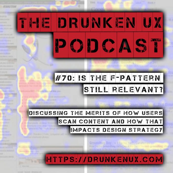
Users have consumed content since long before webpages existed. We have habits of scanning through content that are ingrained in our psyche, because we’ve learned to trust them when information hunting. The F-Pattern is one such technique that eventually informed our design, and still informs how we browse dense content on the web. In this episode, we take a look at that habit and discuss if it still holds value for designers and content creators on the web today, and why.
Followup Resources
Failsafe Lazy Loading (2:29)
- Best way to lazy load images for maximum performance
- Browser support for loading attribute at caniuse.com
- Loading attribute settings at MDN
F-Pattern Usage (7:14)
- F-Pattern: A Secret Weapon To Boost Website Conversions
- The F Pattern: Understanding How Users Scan Content
- The “F-Pattern” – What Is It And Is It Still Relevant?
- F-Shaped Pattern for Reading Content
- F-Shaped Pattern For Reading Web Content (original study) [2006]
- F-Shaped Pattern of Reading on the Web: Misunderstood, But Still Relevant (Even on Mobile) [2017]
- How to design websites that mirror how our eyes work
- Is The F-Pattern Still Relevant in Web Design?
- Klick Consulting
- Myth #3: People don’t scroll
- Readsy
- Using F and Z patterns to create visual hierarchy in landing page designs
Transcript
The following is a machine-generated transcript of this episode. It will contain errors until it has been reviewed and edited, and we apologize for the difficulty that may cause for screen readers. Do you want to help us speed up our transcribing process? Consider sponsoring an episode.
Well, good afternoon. Good evening and good night.
Good night. That’s a quick episode, Michael.
I know. Hey, everybody, you’re listening to the Drunken UX podcast and I am your host, Michael Fienen.
I’m your other other host, Aaron. How are you doing Michael?
My gazebo blew down. What way had Ah, some wicked storms unrelated to the Hurricane Laura came through Kansas this morning and it blew my gazebo down. Wow, folks, this is episode number 70 and we’re gonna be discussing whether or not the F pattern is still relevant. Ah, this is gonna be an interesting topic tonight. It gets a little bit away from the development side and gets us more to the U X content and psychology realm. Some patterns
when you just safe back repeatedly in your website?
Uh, yes. No, I don’t know what kind of websites you visit on. That’s gross, folks. If you have been enjoying the drunken UX podcast, be sure to run by our sponsors. This episode has brought to us brought to you, not us. We’re already here by our friends over at the live at Manning conference, Siri’s. And so if you want to check out, they’ve gotten event coming up on September 15th called the Rust Conference.
Rust is a programming language. And if you’re interested in learning something new, this is a free conference. So run by the website at drunken you x dot com slash rust conflicts are you s t C O in f, and you can get a free ticket
manning publications of the ones who help bringing Dustin show into the show, right?
Yes. Yeah. Okay, so if you want to check them out go, go do that. Use that link. You can get a free ticket and sit down and learn about a new programming language will be there. So cool. That’ll be kind of neat and learn something new.
I think I haven’t anything with trust myself, but I do have a program called Rip Grip, um, on both my clinics and Mac computers and its grip like the command line utility, but written and rust. And it does. It does some optimization ins that make it like a really, really absurdly fast. So I have very good
things about it’s it’s Yeah, one of the new hotness is out there, so, yeah, I’m interested to see what it’s all about. um, to get started. I want to go back real quick. So a month ago, give or take, um, we had absolute 68 where we’re talking about page performance and what you could try to improve page performance just on article that actually made for a nice, quick little bite sized updates to that that I wanted to pass on.
This is from over the dev dot to blawg. Yeah, they’ve got to is like lots of blog’s. Basically, it’s like medium for programmers or whatever, but there is an article over there by Adrian Beachy, Beachy Messi, EEC. However, that is pronounced sorry, Adrian, where he’s got on example of what he calls the best way to lazy load images for maximum performance. Oh, so we talked about this right? We talked about lazy loading images.
That was a thing we covered. I really liked the approach that he outlined, though, and he talked about something that we didn’t talk about. And now I feel bad for having not mentioned that. So because this was a good opportunity toe fix that record and get this ah listed there. This uses his technique is twofold, but it leverages an attribute that is available in HTML five for both images and I frames called loading.
So just like you would set your source or you’re all text right, there’s no
mention of the episode. Didn’t
I don’t remember that we did. If we did, I just have brain fogged over it. Okay, we talked lazy loading. Ah, specifically about the vanilla lazy load plug in. Yeah. This is a browser level feature, though, as a result of an actual part of the HTML spec. So if you put loading equals on an image, you can have it be eager or lazy. Now, eager is just normal. Basically, if you don’t put it on there basically is defaulting to eager, no matter what.
But you can also say lazy. And if you say loading is lazy than the browser automatically interprets that as being something that it shouldn’t download right away, and it waits until it’s in the view port before tries to grab the image.
Okay. Does it be like if you had reckoned image heavy site with pot of rice to it, got a
gallery? You know, if you’ve got a portfolio client list, something like that, Yeah, Anything where you’ve got a lot of images and you want to minimize that load. Now, if this worked everywhere, that would be it would be sudden done. We would have talked about anything else. It doesn’t work everywhere. Safari is still the odd man out on that one. I e firefox chrome.
They all natively support the loading attribute as of they’ve supported it for a year. They’ve since, like, 2018 I think, Um, so you can use it with nothing else if you’re okay with safari, ignoring it and it’ll just behave normally it, you know, it doesn’t break anything. The reason I like this article, though, is because Adrian demonstrated a technique that had a JavaScript fall back.
So you basically was Polly filling for the features that it would work for safari using a plug in and OK, he basically overloaded the element by using data attributes because the, uh, the plug in uses a data US source. Ah, our name source set, um, parameter on it. So he uses that approach, has a little javascript function that if the browser supports native lazy loading, he just wants that into the source field is done with it.
Um, And if it doesn’t, then he just runs the poly fill plug in for it. So it makes it work everywhere. In that case, it just takes a little extra JavaScript, which, if you were going to use the lazy little plug in we mentioned you’re already gonna be going through that effort anyway, So it’s just it was very elegant, I thought, Solution that leverages native browser behavior almost everywhere and still gives you a fallback for safari or older browsers.
If you felt so inclined. What? So run by the blawg? I’m not gonna give you the whole world because it’s long and hard to say over the air. But if you go by drunkenux.com, check out the show notes. There will be a link there. Go check that out. All linked to the can. I use page forward as well so that you can see you know how far back brother Sport knows. But if you’re interested in image performance and you enjoy it upside 68 throw this in your toolbox and let us know how it works for you.
It’s pretty cool.
Okay, so F patterns book F patterns. How many times gonna make you do this F pattern Best F pattern fly. They were getting farther away. Uh, farther up. You know, for Theo F pattern is something some people may know about and some people may not know about. The F pattern is a pattern of reading. Let’s say a pattern of scanning. This is something that goes back a little ways.
So it was first, and I used this word first, very loosely identified in a 2006 Nielsen Norman study. Now the reason I say first in quotes first ish is they did this eye tracking study and they said, Hey, look, everybody is scanning websites in an F pattern. The reality is people scan in F patterns. We did it before websites. We did it with magazines. We’ve done it with newspapers.
Like it’s is a cognitive function that humans have that humans in the western world. Let me be maybe a little overly specific there because our text is left to right.
So does the study say anything about languages that do right to left, like Arabic, Japanese and
right? The original? I don’t think address that. They did a follow up in 2017 where it did come up. And the answer is yes, it’s not just mirrored.
Okay, so this is, like, really like a universal human thing. The fact that it looks like the F that we see in baton alphabets is because we read left to right.
Exactly. Got it. So there’s over two X planet Nick. Babe, ich has kind of a definition here that he used that I’m gonna use, which is the F pattern. Describes the most common user eye scanning patterns When it comes to blocks of content, F means fast.
F isn’t f word
f y i f y i. That’s how users read your content on the Web. In a few seconds, users eyes move at amazing speeds across the page, which is true. So yes, so in other languages as we think about Arabic, Japanese is another one that has a different flow to it. Basically, the way you learn to cognitively process data and information is gonna be reflected in the way you scan for us.
Like I say, Yes, it’s an F because left right upto, you know, if you I don’t know the language, it does it. But if it started right toe left bottom the top, then you would have a completely inverted sense of that.
So this is because there’s also the F pattern design, like when we do like a Web page layout. Yep, and this isn’t the same thing as that, right? This is a different kind of F pattern. It’s not coincidentally, has the same thing. It’s
absolutely related, though, right? Yes, the When we think about websites back in the early aughts that seems jerked. It feels very strange to say it that way, but I don’t like early 2000. I think early aughts is a fun thing to say way were, and going back even to the, you know, late nineties when Web developed really started taking off, we built in F patterns. This would be your header, your left sidebar, navigation and your right side content.
All right, we were created websites with the tools we had, and that resulted in sites that mostly had that layout as a consequence of the HTML that we had developed, which also went together in an F pattern. When you think about table layouts back again late nineties early, Aughts, you know the way table cells flow left to right. Top bottom things plug together. The Lego blocks all fit together, left to right, top to bottom. So and that construct.
So there’s there’s two ways to look at this right there is the the behavioral application of the F pattern, our cognitive F pattern, the way we think. And then there are the constructs and artifacts that come out of that right. We usedto build those sites in an F pattern because that was the way we thought that was the way we made our tools work.
So the site design was kind of a function of this behavioral pattern. Right
now, over time, obviously, we don’t necessarily build sites in an F pattern. To that extent, I would argue that a lot of sites still very much having f style flow to them even though it may not be flow visually. Are you gonna do this every time?
Not every time. Is that
gonna be the whole show? Is just you calling out every time I say something with definite?
The show is an F pattern. It’s everywhere. Technically so. So I think like it sounds like the F pattern is referring to how we scan copy and that I’m imagining in my head is like f being turned on its side, where the largest mine of the F is on the far left, and it looks almost like a hist, a gram of declining size. And and it would represent the amount of attention that we apply to a paragraph as we read it.
So, like at the very beginning, that paragraph, we read all the text and then as you get further down, we read Weston west of it, cause we’re looking for relevant little snippets. This is make sure this is the thing we want to read. And then, like, we kind of do that with the whole document without the
diminishing return, the longer scans that they get fatigued. Basically
another F word.
Have God. I was setting you up for that one,
I swear. So is so. It’s so this. The F pattern here isn’t strictly the construct, like the design construct that emerged because of how we cognitively processed documents. BF patterns actual, referring to that cognitive process, right? It’s
It’s referring to all of
all of it. OK, all
of it, Um and so as we think about this question as we talk about, Is the f pattern still relevant? Your question is, which f pattern? What’s your application of it? I would say about
the simple answer to the question, because the F pattern existed prior to, like f design way out. The answer seems I could clearly be Yes, I haven’t We haven’t changed how they consume content. If anything, I think is even more relevant now because there’s we have so much content that scanning has become even more important.
Let’s let’s qualify this idea, cause I think spoiler warning theon, sir, I think is yes. That’s not universally believed, but we can. We can start talking about this in terms of some other things, right? So if we think about this, um, if we go back to these early Web pages, when we were still designing with F patterns very much in mind, we had these ideas. Most of these ideas came to us from the print world.
Kraft pattern is certainly one whether or not we were conscious of that, but the other one would be things like the full hold,
the fold, the fold
I as soon as it started. Come out of my mouth. Why is there not another word I can use? This
hell is other people,
you know, And we still talk about Still to this day. You hear people talk about, you know, things on web pages of or below the fold. And I think we’ve known for what, 10 years? Probably that the fold isn’t a thing with websites.
It’s sort of like the first page of search results on Google.
I mean, it’s not even that right. It’s the first screen of content that just happens to fit in your browser, which is gonna be half the page or a third of the page, right? And for a long time, we used to because it is very true in the print world. The stuff that was above the fold matter, right, because that was on display and people wouldn’t necessarily walk up to that display and pick up that newspaper and unfold it right there and look below it.
The stuff that was above it mattered.
There was practical constraints about that because you would have, like, you couldn’t read the rest of paper without paying the kid the dime or quarter whenever fast back then we sort of have that now, though, with a lot of news. Bdo old
are you?
You hear stories? Okay, I I’m turning an f word soon. I’ll say that much. Um, the we sort of see that now A little bit, though, Like if you I know that you know about this. But like all the news sites that are require subscription about to read the content, you could read the first page basically above the fold on. Then you have to subscribe to see anything that so it’s kind of pay walling just like newspapers. Houston,
that’s an interest. Had never thought about that. But that’s kind of an interesting
they recreated. They’ve made a like a virtual fold again. Virtual. And I just say I just tell him to fuck off, you know, take that f word.
I have to mark this episode. Explicit are
it’s a call it f pattern. There’s an
article over UX myths that we’ll have a link to in the show notes. They they talk about the myth of the fold. One of the things that the researchers showed is that 66% of users time is spent below the area that would be considered the quote unquote fold during those studies. So what it comes down to is we brought this idea over and we thought it makes it superficially.
It feels like it makes sense like you’re the stuff in the view Port immediately is the most important. What we’ve learned in practice is everybody scrolls,
schooling is free,
scrolling is free, and other people don’t mind scrolling. People are like There used to be this sort of idea that you ever hear this one especially early on air and where it’s like some people don’t know that they’re supposed to scroll a page like I don’t know that I I generally don’t know if that was ever true, but it was said, Ah, lot back 20 years ago. Yeah, people still didn’t know how computers really worked and so they could make sure that’s
I’m sure that’s the case for for some edge cases like edge you X cases. But I think by and large, if you know how to use a mouse, you know that you can scroll a page.
Yeah, so this whole thing that the reason we say all of this is because the fold comes with us, along with this idea of the F pattern, these ideas that were brought over and the important part about this is that behavior. So design changes are designed, changes constantly and to your point, talking about, you know, what are we talking about? F pattern design or any pattern thinking? And that’s the question, right?
Because design changes, we’ve learned new ways to make pages. We’ve developed new markup and new CSS and new things. Let us lay stuff out in newer and column modern for the moment ways.
I think that that is also a bit related to technical constraints. Right, because, you know, in the early Aughts and even the nineties and I would say really up until I’ll say 2010 and later. Up until that point, you know, Web was mostly consumed via screen like desktop screen, which is always wider than it is tall. And so when you have a wider way out, you could you have room to make the content narrow.
They make it readable and you have all the stuff on the left side. You can add navigation other things, too. But now, with more stuff being consumed on mobile. There’s there’s an incentive to make it stacked. They make it like more of a vertical like I am I beam layout. But I mean, I guess your point is that even with an I beam layout, you’re going to still have the F pattern consumption of it yet.
So the Nielsen Norman did a second study. Even they knew that their 2006 study needed more review because today things were different. So they did a study into 2017 on this, and I’ll just quote directly from it here, thinking, thinking about stuff like this, mobile devices thinking about behavior versus technique and one changes in what stays, they said.
Our recent eye tracking research shows that the F shaped scanning pattern is alive and well in today’s world, both on desktop and on mobile, a temporal example of the longevity of UX findings, which depend more on human behavior than on technology that’s so fascinating. Mobile comes into play. We go to highly vertical eyes, layouts, responsive layout, linea arised layouts and people still scan those devices in an F pattern as they’re using the device.
So because the scanning is the thing. The scanning is the cognitive byproduct of the F pattern.
I like thinking about the F pattern design way out as being a product that emerged from this knowledge of how we re like green pages. That, like that, fits a lot better. So that’s going to keep doing this
there. There’s two approaches, right? You read some articles and they’re gonna tell you one thing so overtly and pedley design. He’s got an article, he says. The updated Web design guidelines encourage Web designers to create pages that promote the natural habit of scanning the page. Why? Because if visitors scan and find interesting, valuable content, they’re more likely to stay on the page and read rather than Onley scanning.
He goes on to use this explanation as justification for designing to encourage people regardless of the f. Okay, there’s there is rationale behind that. He’s any. But he says the F pattern makes no sense in today’s modern Web that we can’t we don’t have to design for. We don’t think about it. You have to think about the experience. He’s not wrong, but he’s also, in my opinion, not right, and so
it sounds like he’s talking about the F design pattern and not so much the, um the F pattern in the sense of the cognitive behavioral. Right.
So this this is the challenge, right? As you read this stuff, you have to keep in mind what folks are like focusing on
you. Doing that on purpose can tell
let you decide when they’re talking about this. So you go over to U Ex magazine. It’s an article there that Stephen lawyers wrote. The F pattern cannot only encourage users to stay on your website. It will also cause them to see what else your site has to offer. The usability of your website will increase as you incorporate this layout into your design. So Okay,
wait, what does he mean there? I’m not sure I understand that.
So what he is saying is, if you know it is human behavior scan and an F pattern, you can leverage that to make sure that you are putting things in places that make sense to encourage their behavior. And if you’re doing that. So, for instance, if you if you wanted to take this to a like, super like overly specific application, the absolute best place to put a call out on your page would probably be the upper left corner.
Okay, Like if you had a call to action, if you had a button that you wanted people to click. If you want people to sign up for your service, the best place to probably put that isn’t in the upper left corner. Now, that was a research on that. I don’t know. That’s a fact. But that would be what the technique would tell you.
Not having use a research on this either. I would argue for the upper right corner because the upper left corner is like the root. And if you’re rooting your page on a call to action, you’re gonna that context. But that XYZ kind of pontificating a lot.
Yeah, and I think that’s fine. Much of the disagreement on this idea is on the foundation four design, not whether or not it exists or happens. It’s whether you should use it. And to what extent that, you know, the classic example of this in my head is like when you talk about dark patterns. Now I hate using dark patterns as a focus for anything, and in this case, though it’s because of what it does.
The whole point in dark patterns, is to use psychology against users. Okay, user behavior against users at its root. It’s all about understanding the way we think, and taking advantage of that.
This feels like it’s it’s a similar, um, maybe using similar magical powers as a dark pattern. But in this case, you’re you’re facilitating the users consumption of your content in a way that benefits them. It seems more symbiotic,
right? Like the parents in this case, we’re not talking about it. In the sense of that, it’s bad in any way. It’s just this idea that psychology matters to design.
You know what this reminds you is? Remember that old phrase, Um, technically not f word there. Uh, don’t bury the lead. Yeah, that that’s what this feels like. You know, if you know if you know people are going to scan your content in that way, you don’t put the important part at the bottom of the F you put it drives
the top. Yeah, and understanding. And this is why, as we get a little farther into this, the ant Why, the answer is yes. It still matters is because of that behavioral self understanding, how people work, how our brains work and how that results in engagement on websites is a cornerstone of user experience. Research, definitely. You know, the psychology of design is something we’ve known about for decades.
Um, going back Teoh the way Braun decided, Teoh design electric razors on things like taking advantage of things like that. Make things more appealing to make things more, you know, desirable. And you can apply that in your design. You know, the F pattern psychologically hasn’t gone away, even though our design techniques have moved towards other venues.
Yeah, what Nielsen Norman determined in their updated study was that it ultimately depends on the type of content. So they identified three qualifications for a page where you really see F pattern behavior from the user really stand out, they said. It’s a page or a section of a page that includes text that has little or no formatting for the Web, for example, it’s a wall of text, but no bolding bullets or subheadings.
The user is trying to be most efficient on that page, and the user is not so committed or interested that he is willing to read every word.
All of these things seem like the user self protecting their cognitive energy against unknown value.
Right, So easy. Easy explanation of where you would see this kind of behavior news website, Right, Because a news website or let’s even take this to another place. Facebook. Yes, I did that one on purpose. By the way. You go somewhere like that to just consume the information. You go to the news website to see what’s going on in the world today. And so you are not there to accomplish a transactional goal, right? You may spend a minute there.
You may spend 10 minutes there, you don’t know. So you are going to try to be efficient. You’re going to scan the headlines, the pictures. And even though those sites aren’t laid out in a strict f pattern, right, you will see how things fall on horizontal and vertical lines with the headlines. Um and
you you think with with Facebook you almost have, like, just a series of efs going down. We honestly like it feels like a really apt description of Facebook
that chefs that first point from Nielsen Norman a page or a section of a page. Right? So the individual chunks of Facebook will generate miniature efs as you’re going through going to those Postrel quick, think about it. Or if you want, apply it somewhere. Think about maybe an instagram type location or something. How many posts a Knave Ridge personal scroll through in a day on Facebook or Instagram or some of these sites or or news articles on a new site?
Whatever. But how much content passes our eyes? Hundreds. Probably. We don’t even think about it, really. But how many hundreds of posts we process and don’t pay attention to because they don’t catch your eye.
When? When I when I doom scroll on Twitter, it definitely often feels like just going
off. Ah, uh, the reason we fall to this This use case, I think, is because naturally, humans are very good at scanning. We have trained ourselves to trust our ability toe pick things out. We look for keywords we look for, You know, if we know we’re looking for certain information, their awards will catch your eye or works. We will tune out. I think this
is This is like some either mammal or reptile brain stuff like scanning. Uh, scanning for relevance or scanning for value is very deep seated quality that I think we all in eight we have and use in many, many different areas. And I think that that gets applied to content consumption. Especially now that we have so much like an abundance of content to consume.
It becomes really, really more important. Like to scan things correctly. And your ability to use this F pattern of cognition is, um, kind of a survival tool. Almost
that the digital lizard brain.
Yeah, yeah, techno wizard. One thing
that Nielsen Norman discovered in this updated study to is that users will Genya not genuinely. Generally, I prefer a guided experience if you offer it. So the F pattern becomes more of a default state in the absence of something else.
Okay, So when when we are in a state when you were in a state of self protecting our attention in this attention economy, we default to the F pattern because we’ve learned that it is the most efficient way to protect our cognition. Right?
For the most part.
Yeah. And you’re saying that there this is alternatives. If we can have a guided situation than we can relax that and weaken trust the guide
So going all the way up to that quote I get, I read from Liam Pendley Design. He was talking about focusing on generating experiences that will lead users through not caring about that F pattern, saying designed the thing that they need if you even think about something even way more generic. But like tools like Joyride, what is some of these jobs plugs that let you do things like provide a guided tour of something like any? Have you ever gotten a like a tool you use and they’ve updated it, and they’ve been like, let us show you the new features and have the little dot thing that’ll bounce around the screen.
That’s a joy ride or some variation thereof. Now that’s a really hyper specific example, sure, but you can design a page in such a way as to minimize the amount of content on it highlights. Certain bullet points have very bright and obvious calls to action. In certain locations, you can build an experience that is designed to guide a user through their transaction. Okay, if you do that, they will follow you. They will follow your lead on it.
The F pattern on Lee comes into play in the absence of those design cues and, you know, or, you know, thinking about when you do something. If you’ve got a horizontal stroll and have you ever like you’ve seen like Well, yeah, bounce content Or like, put in like some micro ux or things that our micro interactions that will, you know, balance an element. But, you know, there stuff beyond that, you can scroll this. Oh,
yeah, yeah. I’ve seen that,
like these visual design cues that come into play
the shock most on their periphery.
Yeah, that stuff that’s designed to tell you Hey, look over here. You know, it’s driving your attention, right? Everything’s about drawing your eyes. And so, as a designer, as a developer, if you’re building things that draw people’s eyes, they will let you do that. They will let their eyes be drawn by your design. And so that’s one of those big takeaways as we’ve learned Mawr, we couldn’t do that before.
We didn’t have those options. So we built to the F pattern. We built our our constructs and our artifacts to match the thinking process, and now we can do better than that.
I actually find that like they’re guided things like that. I find them annoying. Personally. I accept that maybe other people don’t have this issue. But I don’t like having to consume content on someone else’s terms because it maybe, like I live in the F pattern so much that it feels unnatural to not be able to do that. The example you provided here Ah, they found, was the consulting dot click.
That’s with a k dot com, and it’s really cool, like is you know what they did with the has. So you scroll down this thing, it’s that you’re it has, like, this purple ball that’s sort of like morphs and shapes and moves down through the sections as you go through them, and it kind of draws your attention to different parts of the page. But I find really distracting, and it I have a harder time reading the content on the page myself.
Um, but it’s cool, like it’s cool looking. I think I just wish that the content showed up in the Purple ball because I keep like I’m trying to read the text, but I keep jumping my eyes back to their purple ball to see if I can, because I’m expecting it to move more. So it’s harder for me to focus on the copy.
I think that the key there is well, while I I absolutely take your point about, you know, not liking that in your face approach. You probably are in the course of a day on the Internet when, just in the course of using websites, you are probably guided through experiences significantly more often than you think. You are
okay by me that
by all the times it isn’t in your face like it is the subtle nuance Toe Howell Constant has been placed. You know, a good counter example. A good anti pattern for this would be. And I’ve seen this. I think I’m CNN’s website. I am pretty sure they do this where they’ll have content, you know, they’re little blocks, their headline blocks all this. Yeah, and then on the far right hand side, you’ll run into what looks like a really tall, vertical block of content on the right hand side.
Usually it’s like an advertising block or something like that, Yeah, these long. And if you’re thinking about stuff like advertising, and I don’t think this gets quite in the dark pattern territory, though it could if you wanted to abuse it. You know, we used to do remember the tall banner ads, and those usually ended up on the right side a lot, because again, we put our navigation on the left side right.
But those tall banners on the right side are visually very disruptive to that cognitive flow because you’re not scanning vertically on the right hash, right? Right. So thinking about some of that like it’s those kinds of tweaks that people make that they would say, You know what? I put that on left side so that as you’re scanning back and forth and up and down, it’s in the vertical scan space for your eyes.
So you actually do see it and we’ll pick up and remember some of those bits and pieces because here’s the thing. Part of the reason we used the F pattern as a behavior is because we intuitively will seek out visual hierarchy in this. Yeah, we’re that even if we’re not there to like having transactional goal If we’re in the news site just catching up on the day we follow the lead headline to the secondary block toe the entertainment section down below.
And so we follow the same visual hierarchy and they have ordered their content in that way to the first thing you see is gonna be the most important headline for the day, you know are turning it. I guess in this day and age and
the’s 10 seconds we have right here what we
and also the that point I just made users prefer to have their experience lead. They will follow, design sent. They will follow information sent if you place it out there for them. Nielsen Norman found this. They said when writers and designers have not taken any steps to direct the user to the most relevant, interesting or helpful information, users will then find their own path.
Eso if you’re fighting path, if you give them bread crumbs, if you give them sent, they will follow it. They were like a bloodhound.
I think that the, um I agree with that. First of all, I think that maybe the subtle ways that you mentioned earlier are things like, you know, a good use of white space, you know, having like like you can. What space is one of those things where you don’t realize its importance until you see content that doesn’t use it effectively.
Tax like a vacuum. Yeah, so if you do, if you have well placed, properly sized white space, it sucks your eyes through the pattern that it creates.
It helps you identify what is content by showing you very quickly what isn’t. And I think actually, advertisements undermined that a lot because they fill up all the white space with ads because that’s what NBA’s do. It makes it harder to distinguish between what’s the content and what’s not. And on sites like I haven’t looked at CNN in a long time, but a site that has a lot of ads or whether it’s internal or external ads, I I
find my experience is often that I can see content like I see it, but I’m not reading it unless it passes like a very quick, subconscious check of, like whether or not this is content, I want to read to all like looking and add, but I won’t actually like visually process any of the words in it unless I have determined that its content that I’m looking for on. But I think that’s weird survival skill that have developed over the years. Information survival.
So, too, this idea that users will follow scent and will kind of take your lead on it. One thing you’ll Sonoran found in their updated study was that there were a set of patterns that go beyond the F pattern and beyond. Like some people say, there’s an e pattern that’s kind of a variation of that. Some people will call it like the Z pattern in my eyes. They’re all kind of variations of the same thing. They’ll have
the broad line at the top. Yeah,
they all have this idea of reinforcing the left right top bottom because your eyes naturally have to sort of typewriter. You know, typing on a typewriter, a slam, that carriage back over. But this Norman found there’s the layer cake pattern. There’s I’m not gonna go into these in depth. You can read it in their study. If you want. They’ve got a breakdown of mall. There’s the spotted pattern.
There’s a marking pattern. There’s bypassing pattern and there’s a commitment pattern. And just as an example, you brought up the consulting dot click dot com. Yes. Oh, yeah, That, to me is a really good example of marking pattern.
Okay, what is what is that one? What is the market better?
Okay, so Nielsen Norman defined it as it involves keeping the eyes focused in one place as the mouse scrolls or finger swipes the page like a dancer fixates on an object to keep balance as she twirls, marking happens more on mobile than on desktop. That ball you talked about so as you scroll this the clicks website, this ball that moves around is designed to keep your eyes on it so that where it lands is the thing that they want you to look at.
So they’re your eyes. They’re they’re tying your eyes to that motion that they’re physically making movement. And so, while the ball doesn’t move, the ball is the mark.
Have you ever seeing those those animated DYFS where it shows like a bunch of images, flashed through in rapid succession? But like the one common element for all, the images remain stationary on the image, so I’d be like a picture of Harry Potter. And like all the different movies, click clicking randomly but with his eyes were in the same spot. Yeah, yeah, that’s what that makes you think of.
It’s very disconcerting as well. Ultimately, even though even though the Niels Norman stuff pointed out that, like, there are other approaches and their folks were saying, you know don’t and here to it on all of this the F pattern behavior is neither inherently good or bad. It’s the way we think. It’s the way we process information now, Blind reliance on it. And what,
assuming, does that mean the point? So
like, if you were to just build websites in F patterns, okay, because somebody said to you, Hey, people scan in F pattern So you should design your Web site with a you know, a task heavy header and a left sidebar and put your content in the middle. Okay? Blindly. Just doing that isn’t good. That doesn’t produce the outcomes that you want. Okay. What? Ah, what Nielsen Norman figured out was that you know, that’s the default state.
That’s what people go to when they’re given no other options, they quoted. They said, When people scan in an F shape, they miss big chunks of content based merely on how text flows in a column. While we are good at scanning, we are generally, you know, say we have that ability to pick out the keyboards that we think are important to us. Well tuned stuff out. We’re still not perfect at it at the same time.
And as we seek to minimize the cognitive load placed on us by a page, Yeah, the reason that F we use the phrase f more than E is like you said at the start. We start as the page gets longer. As we stay on that further, that funnel starts to shave in, and so you start to get a trail off because we get laser. The longer we spend not getting what we want, we start giving up.
Will you go? And it’s there’s like there’s hunting hunting mode. And then, um, I guess I’m not sure what the opposite of hunting mode would be, but it zing. Yeah, yeah, that’s a good That’s a good one. Hunting or maybe foraging. That’s a good F word. If you’re hunting you don’t want to sit too long on one thing because if you sit too long on content, that’s time you’re not spending looking for other content.
But if you’re if you’re grazing or foraging, you want to get as much as you can out of that because you’ve found you know, this berry bush of content and you want to get every Barry you can because you don’t know if you’re gonna find Berries at a different spot. Yeah, so it’s really like it’s it’s two different things. And I think that maybe maybe the take away from that is you want to put the the stuff that is only relevant for people.
Like if you’re gonna put Berries on the bush and then you want to put them towards the bottom because that’s when those the people that you know, we’re like, oh, why they want Berries. So I’m gonna put the Berries that here at the bottom of the bush, rather than just like all around, because you’re If you’re If you’re scanning their paragraphs, then you’re gonna be looking at the content of the beginning, and not so much later on.
If you don’t agree or If you’re not agreeing with That’s what you’re looking for. I’m rambling there, but does that make sense? You
got a little bit long? Yeah. Yeah, I tuned out. I’m sorry. What drinks
were you f patterning what I was saying.
What does he is Drax saying in guardians of the galaxy, I’m sorry, wasn’t paying attention.
Yeah, I feel that, man. I feel that
while you were talking, actually, I The thought occurred to me when I asked me Well, what I mean by Blind Reliance. You know, as I was reading through a lot of this stuff and pulling articles for the show notes and what not? No, sir. Norman did their original study in 2006. I was 14 years ago, and I remember the kind of sites I was working on them. That was a long damn time ago.
They were smart enough to know because believe it or not, they are smart people. And they realized in 2017 that that was information that needed updating that just like things like we talked about how much design changes, you know, skill morph ism. Great idea. Great design. When the iPhone came out in 2007 right? How much skill dwarfism do you see in design today? Because
far must for us weigh
less. And yet, as I looked through these articles, and if you go look through some of the stuff in the show notes and look at some of these articles that were written that all talk about how important the F pattern is, not only do they reference the 66 2006 study that Nielsen Norman did, they even just great the screenshots from it over and over and over again. And none of them reference the 2017 study. For the most part, that’s the blind reliance.
They read something once they read a 14 year old article on on this topic and assume everything in it is still true and accurate today. That’s where you can be blinded by that data because it’s 2020 now, and even 2017 research is getting a little long in the tooth. In some cases, I think it’s still very good, and still we’re going to say behavior doesn’t change that much.
If you want to get into the psychology of this, I said a couple times now, humans are good at scanning. Generally speaking, we are good at reading. We learn to read in a certain way. Though we we learned to read with I don’t even know what the right word of it would be. You learn to read in elementary school to these tests and you’re given, you know, you take thes thes tests by them yet until, like, middle school in high school, the state tests and all of this, um and they’ll give you the paragraph to read right between the S A. T.
Yet yet the paragraph you have to read, and then they take the paragraph way. Then you have to answer questions about it, right? And so we teach you to read these stories and read every word and toe. Hold them in your brain. The reality is there are other ways. We process information
Well, before you get to the other ways, do you remember? You remember what work were roughly the same age. So the writing classes we had an elementary grade school are probably similar. You remember how they told you to make a paragraph? What do you put? First paragraph? Your thesis? Yeah, the main idea or whatever. and then below that is, goes to supporting information like that’s F pattern scanning right there. You can put the most important thing first and then supporting thing is under it,
because to go back to what we were saying about where the F pattern presents itself. Walls of text walls, oven, formatted text, paragraphs of text. That’s where people’s F scan the most. Yeah, they’re looking for those keywords as like Oh, I don’t see that in the top of the paragraph. I’m gonna assume that the rest of the paragraph doesn’t give me that. For the most part, we do. We do that we trust in it because most of the time that is right.
Yeah, you know frequently. That means we can safely do that, but it’s not always right. That’s why this Norman found that people will miss important content because they trust in that too much because we are in perfect beings. We’re trying to find efficiency. There’s a site reads ee dot co, okay, And so I’m I was talking about this earlier with Aaron that as we talk about scanning and reading and thinking, and this was one of the coolest things when I found I saw this a few years ago.
I’m a slow reader. I just generally like I know people, man. They could knock out a 3 400 page book in a couple of days. And I’ve never understood that that takes me weeks to get through, because I have I read very much the way I learned as a child. I need all the stuff. As I got older, I started finding out about these people that scanned like they scanned through paragraphs. And that was partly how they read faster.
Yeah, And then I found the site reads edotco, and I only bring this up just as an example of, like, how we cognitively processed data. They show you how you know the average human reads between the 200 words a minute, give or take somewhere in there. Okay, They can get you to read upwards of 1000 words a minute, and they do it based on scanning individual words and how you pick up the words around them.
And you start to realize that by reading one word at a time very quickly your brain still retains all of the information around it. Okay? like you never learned this as a kid because kids can’t do this. I, you know, in general, like we don’t have the neural pathways t pull it off functionally. But as you get older, your brain becomes very attuned to scanning. That’s why we do it. And so this reads.
It uses a tool called sprints, and you can upload text to it and try it on your own. But they focus your eyes. They use a marking pattern. Focus your eyes on one word and they start cycling those words very, very, very quickly. And then, I don’t know. I think it’s another tool I found. I don’t think it’s this one, but they would ask you questions okay about that information.
And it was astonishing how much information you retained by scanning that way, and it may makes you way more efficient. It’s not very good at it, mind you, but yeah, I very quickly in the course of a day, I went from like 300 words a minute toe like somewhere in like 607 100 words a minute, because once you realize how easy it is to do, you start turning up that speed. It’s like, Oh, this isn’t hard at all off
off to try this out. I mean, I know we talked about this earlier. What I what I read. I often have to re read sentences more than once, because sometimes my I don’t like correctly visually process the data. And so not being able to go back and re read parts that I just missed, I think my work to my detriment.
But May Maybe this is something that I could use to train better on that I don’t know. I’d be interested to see what could happen with that. I’ll give it a shot.
It’s just one of those things. Like anything, it takes some practice, but it’s a new way of reading, and so it makes it so that you can scan things like a book not using the F pattern. You use a different approach, but you still get all that information and you miss less things as a consequence, because now you’re not scanning just to find relevancy, your scanning to actually intake all of the stuff and you’re gonna then apply that.
So, whatever you’re reading a Web page or what have you just very interesting. You know, when you start getting into the psychology stuff of how we process data, it’s, ah, psychology. The right word for that, Maybe it’s not. I mean, is it anyway, uh, the in goal, you know, focus on the experiences you want to create. You can consider how the F pattern may support and enhance those elements, but you have to design to it directly.
You could also think about how you want to lead the person through. Is it a landing page? Isn’t a news article or a blawg. You know, if you’re if you’re writing long form content on your website, that how you approach that will be very different from how you’re making you know, landing pages for products, sign ups or something like that are white paper downloads.
But understanding based user psychology helps you make decisions as a designer or a content creator. Let us know how how you think about this or what relevance do you have. I, my answer is, is they have pattern still relevant? I think the answer is absolutely Yes. I think we just find relevancy in it differently now. I think it applies to the work we do differently and how we want approach, content, strategy and how we want toe encourage user interactions.
I think all of that comes back to those things. Even if we aren’t putting a left hand side par on our websites anymore or something like that for sure. Think about to go visit some websites and think about If you’re over MSNBC, how do you scan that? If you’re at YouTube, you know, how do you consume your YouTube home page and all of those thumbnails? How do you scan that to find the videos? You wanna watch, um, or there’s our
Netflix or
Netflix? Yeah. Think about all of these different applications. Let us know if you find a good example or if you find an example that you think breaks that mold really well, in particular.
Howdy, I had mentioned knowing those the ones that are usable and have content that you’re consuming but are not laid out with. With that, I wouldn’t see those
are you know, if you want to get crazy, go real the knees. Go read the nails. Norman. That really it’s hard to say after a couple go read the Nielsen Norman studies and go look for the other patterns. Go look for spotted spotted patterns. Go look up these other patterns and see where they call and tell us. You know, Are they particularly effective or not effective? How can you apply them? I think there’s a lot to learn.
There’s a lot like the pattern stuff is like the gateway to all of this other world of how we consume information and apply that towards design and content. So let us know and we’d love to talk to you about it and otherwise I’ll catch you after break. Erin, of course, you’re a big Ruby guy. But have you done anything with rust? Have you played with Rusted all?
I haven’t other than the things I mentioned earlier about rip crap, I have only heard a little bit about it. I have a friend of mine applied for a job at the Mozilla Foundation, and apparently it was like a rust advocate. So I guess they’re called crustaceans. If there and though it is the best part, their mascot is named Ferris. That’s fantastic, E I mean,
come on, you can’t get a lot more clever than that.
So I don’t know a lot about. I know that it’s similar to C plus plus, although it’s it’s like performance in similar, like performance wise. I know it’s
it’s really got a lot of folks attention, like for the new hotness and programming like I know there’s a lot of, like energy and excitement kind of building up around it at this point in time.
I have a lot of love for Mozilla as a as an organization, and so, like that alone is enough reason for me to want to know more about.
It’s been frustrating, right? Cause here lately have not been able to go to conferences. Most of my conferences have either been canceled or have gone all remote at this point. So if this is sort of a great opportunity where if you’re wanting to learn something new, if you think that this would be interesting to you need, you don’t have the time or resource is to get away from your house. On the live at Manning conference.
Siri’s is actually hosting a Rust conference all online on September 15th. If you go to Drunken UX dot com slash rust con, that’s are you s T. C o in f You get a free ticket. Sweet. So if you’re interested in just even trying to figure out Is this something that might interest you? Is that something that might be your workflow? Are my, you know, make some new opportunities for you? We talked recently with Jeremy Walker from exercise.
Um, all about learning new programming languages.
I think rust is wonderful. This Yeah,
if this is something that is in your wheelhouse or that just interest to you can’t be free. So the life of Manning Conference Siri’s Manning Publications, Their a great group of folks who work with them In the past, Dustin Shout was one of their riders that came on with us, and I believe that was the CSS and Js episodes quite a while back. But they are great folks. They make tons of learning material.
So check them out on and I say, if you want a free ticket Sept. 15 that is, I think from noon to five, I believe, and you can get a free ticket at Drunken UX dot com slash rust gone. Excellent. I hope you enjoyed this episode. I hope you think about the F pattern a little bit and how it fits in. I’m sure many of you have probably heard of it. Some of you may be having and say, if you have any thoughts or input or anything you want to add to let us know we screwed up.
Of course we got I was really excited about getting in the stopping and we missed, like, through of our primaries Start. I’m not gonna go all the way back and edit anything in at this point, I drank, though this evening Brooke Lottie, the Lottie Classic, Lottie, which is their 10 year or was there 10 year? I think now it’s actually it’s like a tin blend or something. And I’ve had on the show before.
This is the fancy green bottle. The same folks that made technically Scotch. That was very unpleasant. But the classic lot is quite nice. It’s UNP eded, Isla Scotch. Very mellow. Kind of sweet, with a bit of smoke to it. Free. Very nice. So sorry. Didn’t tell you that it started. I don’t know what you had. You had something over there.
Yeah, uh, just being a margarita, Um, I’ve been I think the second or third time now the Caza Dorries tequila. It’s a nice like just, you know, consumer bubble. Roughly, I would say it’s comparable to liken Absolut vodka like it’s around $20 a bottle. Nice little Miss Cal on the chance to give Gabi based anyways, through that was in triple second, some lime juice and this tasty very cool here.
So, uh, I don’t think we have a so we have facebook dot com slash drunken new X. You can come connected us there and tell us all about times that you’ve interacted the sites that weren’t f patterns or the times when you read the end of first because that made more sense. You can also connect with us on twitter dot com slash trucking ux and instagram dot com. So I struck in you X podcast and at Franken ux dot com slash discord to come talk with us.
He’s not slurring. He’s just being a jerk, being a FERC. Okay, it’s time to send Aaron to bed. As always, I hope you enjoyed the episode. If you wanna drop us a line hit us up on New York’s dot com, send us any absolute ideas if you have something he wants to cover. We’ve got some stuff in the pipeline that I think you’ll enjoy that have coming from user requests.
So our listener request rather So be on the lookout for those because we practice what we preach and we keep our users close. That’s the opposite. I’m I should not drink Burke Lottie when I’m doing this because this would have been better.
Did you say for Sony’s close?
Keep your personas, but your fuse er’s closer Bye bye.
This episode of The Drunken UX Podcast brought to you by the live@Manning conference series. APIs are the backbone of modern, interconnected software systems. Join us at the API live@manning conference and ensure your APIs are flexible, functional, and user friendly. Register for the API conference, August 3, for FREE!
