We’re less than a month out from the next big election here in the US, so what better time than now to take a look at our candidates’ websites and review some of the things they’re doing wrong or could improve. We take a look at problems ranging from accessibility to hostile design and more that are pervasive across political campaign sites, and suggest things that they could do to improve their UX.
Followup Resources
- Card Sorting at Usability.gov
- Contribution limits at FEC.gov
- Dark UX and UI Patterns in 2020 Politics
- Money & Loyalty: Comparing the US Presidential Candidates’ UX Strategies
- A UX designer breaks down the intentionally malicious design of Trump’s campaign website
- UX Review – The political party websites
- UX Wars: Top 5 Democratic nominee candidate websites
Transcript
The following is a machine-generated transcript of this episode. It will contain errors until it has been reviewed and edited, and we apologize for the difficulty that may cause for screen readers. Do you want to help us speed up our transcribing process? Consider sponsoring an episode.
Hello, everybody this-What? Did you just try to interrupt me? I’m doing the intro.
I was waiting for it and you didn’t start, so I was gonna start singing Cabaret. Would you like to do the intros? Er, nope. Nope. That’s right.
Because this is episode number 73 this week. We are playing politics with user experience. We’re gonna be looking at 14 of our Well, I’m not going to say favorite, but closest campaign websites to Aaron, I and E seeing what they do, right? What they do wrong, what we would change and why we would change those things, folks. Welcome to the show. I am your host, Michael Fienen.
Okay, I’m the other other host, Aaron Hill. How are you doing, Michael?
who apparently felt the need to eat dinner while we were recording. Jesus.
Want something off my drink, man?
My God, folks, if you are enjoying the drunken UX podcast and I sincerely hope that you are. I hope that you will take the time that run by our kind and fantastic sponsors over at the live at Manning Conference Siri’s. They are, in fact, depending on when you’re listening to this, which hopefully is on release, take its October 12th, and that means tomorrow they’re doing the women in Tech conference just stopped by our site.
drunkenux.com/womenintech that will take you to a landing page where you can sign up and just get a free pass for it. It’ll be it’ll be hosted on Twitch and you’ll get toe learn all about everything from what it’s like to work in the industry toe VR and algorithmic design and all kinds of stuff. So, um, that’s gonna be a super awesome little event that costs nothing.
While you’re typing things into your browser, you should come by and check out Twitter and facebook dot com slash junkanoo x instagram dot com slash drunken ux podcast. Although let’s be really you’re gonna do is on your phone. That’s where people use it. So open up your phone and search for drunken UX podcast. You can. A
lso, when you’re done typing drunk into x dot com slash women in tech, you can go to drunken you x dot com slash discord and come and talk with us about things. Hello?
I, uh, see, you are clearly eating and way will ask everybody to forgive you later, but I would like to know what you’re drinking with. Said
I have have a tanker and tonic.
Didn’t even get creative on your drink tonight. You just like I’m just found,
man. It’s It’s a holiday weekend. So I’m like, I’ll give you Finish my thought. This
is one time, but we’re gonna We’re gonna notice in your sound check later this year. I’m drinking a bloody Mary Different beaten path for me. Um,
I gotta say the continue drinking out of is really interesting. What? Is that, right?
Yeah. Um, So my buddy came over here a couple weeks ago. A couple weeks a week ago. Something like that. Um, he is also doing some online conference stuff and one of the events he’s working with wanted him to do some, uh, like cocktail making demonstrations. Eso he came over because I’ve got a little wet bar in my house.
So we set up in front of my wet bar, and I did video for him and audio and all that, and kind of mixed together some quick little 34 minute videos that they could share through the Livestream. So, as part of my illustrious compensation for this fantastic endeavor, I got to drink the cocktails after he made them. And hey made one of the drinks. Was Bloody Mary on DSO? He made a fresh, bloody Mary mix, and I took a big jar of it.
So I’ve got one of these super old fashioned the ball jars, like the old blue glass ball jar with a glass and a bottle of little metal like crank down lock on. It
looks like a really big bottle. Yeah, it’s fantastic,
and I’m always looking for excuses to use these things. So it’s like man, filling it up with just a good old fashioned Bloody Mary mix, donned keeping that in the fridge and can’t go wrong doing it with Tito’s because Tito’s vodka is good in absolutely everything, so a little bit spicy, too. It’s set for a few days now, and it has, uh, heat it up a little bit in that time getting started this week, we’re gonna be talking about political campaign websites because we thought it was, you know, kind of a fitting thing.
But most importantly, somebody asked for it. This was a request from a listener. And so we said, Yeah, we can do that. And I figured lining this up sort of leading into the election was, you know, a appreciate timing is that using the right adjective there?
I got a few weeks until Election Day, so
yeah, so this is and so let’s start with my drunken disclaimer. This’ll because this is this episode definitely needs it. First and foremost, we avoided sites that were not relevant to us. So when we were looking at campaign sites, I looked at sites for Kansas. Aaron, the sites for New York. We didn’t pull up sites for folks in Utah or Florida.
Um, we did Look at the president. Presidential candidates, obviously, um, you know, senatorial, uh, openings and seats, house representatives. And without regard for the politics of the candidate, Mhm. We are looking at the usability of these sides. We’re looking at the accessibility of these sides
will both endeavor to keep political opinion and bias out of this and deals strictly with data and objective stuff as much as possible. I would say the only political statement I will make is that you should vote. I don’t care who you vote for, just vote.
Another quick note are too quick. Notes. We did do some performance testing on these sites. I throttled my connection to a 100 megabit, uh, connection on these sides because I have
e hate that you have to throw e.
I do have fiber, and obviously that has an impact on how quickly stuff loads. And that is not a fair representation. I think for most areas, that’s a reasonably good cable Internet connection at that point, um, so there’s that and the last point I’ll make is what we’re talking about Now. If you try to go look at some of these sites, you may not find it because these campaign sites do change and they do change a lot more closer to the elections.
So so that. But our look here is kind of a snapshot in time. Over the last couple weeks, as we’ve looked at these sites, And when we benchmarked, um, um, I used I use a pie hole at my house, So when I did stop, it’s not that funny.
I’m laughing because my when my daughter was younger, she thought that the pie hole was your butt. It’s not It’s not. It’s your yes, it’s your face, because that’s where you put pie. But
that’s where you put pie. Yeah, At any rate, I did turn off my pie hole for those, uh, for those tests, and I also made sure I didn’t have. I didn’t use Firefox because they have a lot of native blocking built in. So I tried when I did my speed tests to make sure it was as vanilla and heavy as designed, so to speak. We looked at 14 so there’s 14 total sites in this list. From a performance standpoint, I had to have to say I was kind of surprised.
Actually, I was really prepared for these to not be good. Mhm, and what I found was, oddly enough, like the small local candidates had what I think we’re obviously the simplest sites. As a result, they were also the fastest mhm. They were the least advanced. They didn’t have funky, you know, roll over states are Paracels and Top or YouTube videos. They were a page of html on a couple photos.
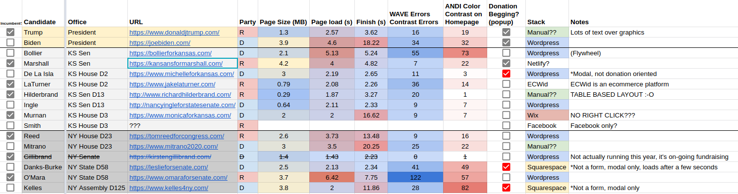
Yes, I I don’t know that that that’s that surprising, I guess. But I guess I think what I was more surprised of was I expected some of those sites I guess, to be mawr, like, Hey, we’ll just throw it, Yeah, in weeks or square space And not all of them did. So That was interesting. Yeah, size wise. So here’s where we start getting getting into numbers. Um, the mean site out of the 14 was 2.4 megs.
That’s that’s pretty small, like all things considered.
Yeah, again, I really expected it to be a lot higher. Um, that is the transferred size. So I’m talking about, you know, compressed to G zipped what is actually coming down the wire to you, Not what it’s like once it’s expanded. Some of the sites actually got pretty big with that, but I felt like what mattered was how much data had to come down that wire to get to you wherever you were keeping in mind.
Like in Kansas in particular huge chunk of our state is very rule in nature and doesn’t have access to fiber like some of us do in good old Pittsburg, KS. Oh, that’s that’s a real issue. The median was 2.55 megs. So pretty close there. You know, you’re, you know, difference of 0.15 150 kilobytes. Give or take the median website size on http archive is 2.1 megabytes for comparison. So yeah, a little bit over, But not by a whole lot. Really? That was You know
what’s really surprising It was interesting Is, um there doesn’t with respect thio, page metrics and telemetry. There doesn’t appear to be a consistent correlation with either party in any direction like there the performance. Like I see the largest page size is 4.2 megs. It belonged to a Republican, and the
the smallest was also small
speech. I was also a Republican at 0.29 megabytes that that site, I think, might be my favorite of all of them because it is a table based layout site and like like written in manual, HTML likes it. It does. You said looked like a 2002 like brochure Where site. And it’s like it really does. But, man, like, I got a lot of respect for that. Like that. Zlook some really like Like traditional American bootstrapping, right? There s o
The other performance metric we took a look at was loading time, Uh, mean was 3.17 seconds. Median was 2.38 seconds. Both very fast times. And the HDP archive median was 6.7 seconds, almost three times what these sites were. So the load times on these sites was actually incredibly good. Nancy Angle. She came in to 30.11 seconds with a finish time of 2.33 seconds.
So, you know, 200 milliseconds from on load to finish like that, that timing is on lock down. Basically, the fastest site was the one that Aaron brought up. Richard Hilderbrand. Hilderbrand. Table based layout, 1.87 seconds. Finished 3.27 seconds. The but loaded in 1.87 seconds. Ideally, you still want all of these times lower, like, ah, one second load time is sort of like the golden.
Yeah, I don’t think anything quick. NAFTA has that zone like that. That is not an easy achievement toe make.
Oh, if by the way, if statistics and page load stuff interests you and you want to know more about first content full paint, check out Episode 68 where we talk about page performance.
Yeah, that’s right. So let’s start getting into some fun topic. So first off, accessibility.
Mhm. All right, so before we get into this, All right, So my my bias, my bias here was that the the sites that were left leaning would be more likely to have the accessible because they’d be more likely to care about that. And that’s my bias coming into this. But what What was your finding, though?
My finding waas It’s like, God awful mess out there is really what?
What did you use to track?
So yeah. So I did a couple things here part of this, and and the meat and potatoes part of this discussion is gonna be some manual test stuff. I did, I did. On every site we went through and checked every site in the wave extension. So if you’re not familiar with it, wave makes a plug in that you can load it in Firefox and Chrome, whatever. That will give you a quick automated scan of a page.
This is not on end all be all because it is a programmatic pool, so it can Onley see things that it can see on. There’s a lot of accessibility stuff that is not testable in that way. So what I did was I took the the Big Two, um, that it scores, which are accessibility errors and contrast issues and added those together.
So the mean of these 14 sites was 30 total errors issues, and the median was 23 to give you the range, though, because I think the range is a little valuable. The lowest number was seven on a Kansas candidate, and the highest was 122 with one of the New York vote. By and large, interesting both of those Republicans. The lion share of these issues was contrast far and long.
I didn’t actually separate the numbers out, but I just visually as I was going through and adding them up like contrast was like the failure point for most of these, Uh huh. But not the only one. So let’s talk about how how things really fell apart. As I started with this stuff, Trump made one error that drives me nuts, okay? And that’s having photos and using the photos as a backdrop for text.
And so okay, in this case, like he’s got a lot of white text over busy photos in some cases, like very active. In one case, he’s got white text over a photo of one of his signs, and while there is like a semi transparent layer between them, it’s still a shade of white with white on top of it. That’s the and so when I say like wave can’t test for everything, the wave plug in can’t check that kind of thing.
It’s not able to know. And where text falls on some of these photos is entirely a function of how big your browser is, so you do have to be a little considerate of some of that kind of stuff. But that issue to me was a big standard, and it’s something that’s so easily solved.
Yep, just do a drop shadow. Just do
drop shadow, put black box behind it or, you know, a semi black box. Anything to really provide a hard separation between that text and the background.
If you do a drop shadow, I believe the parameters are two pixel to pixel drop shadow with a black. Um, it’ll fuzz it just a tiny bit, and it will basically give, like, a very thin black outline around the text. And you’re guaranteed that it is readable on pretty much almost any kind of background. It’s They put it over top of the Jackson. Yeah. Yeah, exactly. Put it like a Jackson Pollock painting. It might not make much sense, but,
um, so I’m gonna call out Barbara Bowleys site. Okay, I noticed this immediately, and at first I got excited. Then I remembered what people told us in the past. Ah, she’s using an accessibility tool from user way. So it’s a little javascript plug in on the page.
You know what I learned? Control. You brings it up, which is the shortcut for viewing the source.
How interesting.
So I can’t. I couldn’t view the horse horse with keyboard keystroke. I had to use the mountains.
Okay. Yeah. So that’s funky. You can also like, just when you hit the page If you just hit the tab key the first time you hit the tab key, it brings up the accessible women. You Oh, that’s cool. Now the reason I said, Oh, wait a second is because there’s Ah lot of feeling and it’s entirely correct that while the tool is useful and it has a lot of features in it and all that, most folks who need to use accessibility enhancement features already have something built into their browser.
They already have their tool set at the ready for that. And so they’re not gonna go hunting looking for a custom one on the website. And in fact, those tools can sometimes clash with their native tools. So it’s good to see that they cared enough toe do it, but it’s unfortunate that they did it. If that makes sense, I know that’s weird.
But now what I do also have to give her credit for, though, um, bullying site is the Onley one out of all of them except Biden’s. And I’m not going to consider the presidential sites on this that had an accessibility statement on their site. Uh huh. And it kind of makes sense because she was a doctor, but I don’t know if that factored into it or not.
But nobody else besides Biden site had any kind of accessibility, statement or commitment on their site. So it’s interesting. It’s disappointing. Yeah, I think more than anything,
I think having that accessibility tool feels like if instead of having a wheelchair ramp if you had one of those things where you sit in the chair and it, like, rides you up the stairs or whatever, because if you were coming there in a wheelchair anyways, you wouldn’t be able to use that
right? Here’s the other irony about that. I’m sorry, Barbara, but she had the second highest number of wave failures. S 0 122 is highest. She had 55. So one problem that her site had and that led me into a much deeper rabbit hole as a consequence, was the issue of keyboard navigation. Mhm. Oh, my God. Oh, my God. I was not prepared for how much of a shit show keyboard navigation is for folks. The awfulness with which some of these sites go.
And I originally when I had first started testing this, I had started on Trump site and I was like, Man, it can’t get worse than that And it did. Many of the sites had no focus state whatsoever of any kind, really. And so and Trump’s was the first I noticed. Like as you tab through that donald J trump dot com, you have no clue where you are as you tab through that site. But there’s there’s nothing. There’s no hover state. There’s no underlines.
There’s nothing. But then I started looking at others and time and time and time and time again. Nothing no states, no boxes, no outlines, no underlines nothing. Mhm I I was legitimately astonished because it wasn’t two or three sites. It was like half of them. And even then, some of the sites had focus states on some things and not others. I ran into sites that had sub navigation that you couldn’t get to from the keyboard at all.
There’s no way to do it. And the parent item on one of those wasn’t a link, you know, it was like just a hash, you know, no link with the drop down Onley get. You can only get to it through the house there was no way to tap into the sub navigation, so that entire menu was useless to anybody with a keyboard. I know
this isn’t keyboard navigation, but one of the sites disabled the right mouse button. Oh, that’s right. They did that. Which I usually see that I’m like artists, websites and stuff where, like they don’t want you downloading their art. They just stable right quick. And the when you try to right click. It says, like, you know, all rights. Reserved your car. Yeah, I Whatever, man. One site
had a tab index that was just head over heels. There was a form in its header, and as you tap through the page, you skip to the form you went through the whole page and then it through you back up to the top when you got to the bottom of the page to go through the form Oh, my God. Tab index was all over the place.
One of the sites had really good focus states on everything, but they had they did that technique where instead of just having responsive navigation, they had a hidden mobile navigation. And so, as you got to the end of their primary knave and kept hitting tab. It actually opened up the mobile nab. You had to go through it a second time. Mhm the one of my favorites, though my absolute favorite thing was a site that had focus states they put a box around.
Everything is you have through it. But when you got into the content and hit any kind of links, the focus ST changed the text to white on a white background. So you had a box around that you knew you were there. But the text went away because like, Oh, but, uh, one of the sites had video. Will not one of the many of them had video, but only one of them that I looked at had video that had curated manually written captions.
Ah, few of them had auto generated captions, which isn’t terrible, but it’s not perfect. And then the rest had some had no captions like not even auto generated. I don’t I didn’t even know that was the thing. I thought YouTube automatically did that now. But not having captions on your videos is a big one. And I was really pleased because the one that had good manual captions didn’t have the same information in text.
Otherwise, like the bio section of their website was just a video. So you really needed the captions in that case, or else you wouldn’t have any information about them? Um, that was important in that case, Needles to say accessibility is, uh, huge, I think failing in this case, Um, let’s talk about user flows. Let’s talk about some of these user journeys that happen first and foremost and most disruptive. Let’s talk about the fucking interstitial and pop ups.
Wait to find interstitial is really quick, so I
can interstitial is a page and or pop up that completely blocks you from continuing on to the page as opposed to a pop up, which the page itself loads. But something pops up over the top of it. You see this a lot, like you go to a block and they pop up, subscribe to our newsletter. And so you get this black. You’re not there to subscribe to the newsletter.
You’re there to read the block post on dso this attention begging and this demanding of Hey, do this thing that you didn’t come here for is itself very disruptive to users now granted, yes, a lot of people go to these sites to donate. I get that. I don’t know that it’s the most important, and I do know there are ways to do it less disruptive. Lee, if you’re
going to a site to donate, you can vote the site normally and you’d look for the donate button. And I presume that the candidate will always make the donate button very obvious because they want you. Thio, you don’t need to have the interstitial thing. I would I would love to see an A B test statistics when you have.
If you split, if you split it 50 50 and you had the A group would be no interstitial donate request and the B group was with one. I would be really curious to see if if Thebe Group was actually had more donations.
One thing that jumped out at me with these so ah lot of these sides, I’d say half of them had some form of pop up or or interruptive experience some of them that was donation begging. Some of it was just signing up for, you know, newsletters and whatnot. There’s ah sister, brother stir step sibling to the interstitial, which is, um, the sticky bag. And the only site that does it is Biden’s where on their site, the bottom stays stuck with donate options as you scroll the site.
Oh, they call this
out. Specifically, there’s an article over Try my You I that will have length in the show notes. They looked at the top five Democrat nominee sites earlier in the cycle, and they did an incredible job. They lined up like 50 tests with a bunch of people. I’m Canadians. They tried to find, like, a neutral sort of group, so to speak, eso they actually used Canadians as their test subjects for this and scored across the number of metrics to see, like which sites were sort of sort of objectively best.
They made an observation, though, it said, Out of the 50 tests across all candidate sites, Joe’s site was the Onley site that made the user less likely to support the candidate. That specific tester cited the whole donation scheme as putting me off, quite frankly, on its its this idea and why I get to this whole thing about the pop ups and the interstitial and all of this.
The begging, the donation begging that takes place is I find it incredibly off putting. And I know I’m not the only one in that boat that you don’t have to have five different places on your page with donate buttons. One is good enough. One in the knave. I know where it is at that point, like E don’t need it everywhere. And and those folks will find that button if that is what they’re there to do.
This this reminds me a lot of way back. I think in season one, we’re talking about e commerce sites and there’s that whole pattern of, you know, really pushing the hard sell and asking for a bunch of information from the user and trying to, like, kind of compel them into making a purchase rather than just trusting that. Like if the users interested in your product, they’ll want to do the sale like they want to enter a transaction with you.
Something with politics, sites. If I actually stand behind you and like I like the politics you offer, you have good content, have good policies, I want to give you money like I want to support
and build those C t A s into the obvious conversion points. Yeah, the middle. The random middle of your page is not a conversion point that z there’s nothing happening there that would that would entice somebody. The things I would like to see because a sites these sites all make it very easy to give money like it’s it’s absurdly easy. They all they care about is you giving the money ultimately.
And so the constant repetition of these buttons of these blocks starts to reek of desperation. The worst one I saw was a campaign that didn’t do anything except linked to PayPal on our just felt gross like that. Didn’t even feel right like that. Felt like this dude’s gonna take my money and go buy some ball jar bloody Marys or something. I would,
I think, in that case I mean using, ah, pay clearing service like Act Blue or win Red. You know, I guess maybe isn’t that much more trustworthy than using PayPal. But if it was something like PayPal or Venmo or whatever, I would be really worried that it’s not being recorded correctly or that there might be more like more potential for campaign fraud.
Um, the like, the areas I see room for optimization. And this is one thing you brought up. Bernie Sanders did this during the primary where when you went to his site, he had a donate the average button. So I think it’s like 27 bucks at that point.
It’s something like that,
Um, and this is a similar technique used elsewhere outside of politics. Anybody who’s ever looked at the humble bundle right? Humble bundles, the thing you could go. It’s Ah, little video game bundle you could buy. They rotate games in and out of it, and the amount you pay goes to charity. And it’s a pay what you want kind of model. If you want to pay a dollar, you can pay a dollar.
They use that donate pay the average donate the average as a means of encouraging people to do that. And they do. That’s the thing like that is a proven, effective tactic to get people to give up
that the more people do that it bumps the average up. So
it does. That’s that’s the thing. The average does go up. It does you can literally see that it is an effective tactic to get people to give more money. When you look at these sites 14 sites we dug through the approach to raising money is lazy. Yeah, I hate to be mean.
I know folks work hard on these things, but at the same time, there’s so much room, the test, the adjust to optimize and do better and make a better experience that if you could just go through and turn those nuts a little bit, you’re gonna find that you can actually get a much higher conversion, right? I would.
I wish I wish they would doom or a B testing with this. And I’m surprised that the higher profile candidates don’t or if they do, they don’t disclose that they do. But I I bet there are certain strategies that are more effective. Like, you know, they raise a million dollars. Could they have made two million if they had done, you know, not doing sticky begging or not doing interstitial? And could they made more by just guarantee you
they could? I would absolutely promise anybody that that that little bit of research I looked, I tried to find if anybody had done. Actually, you x research on that. I couldn’t find any. So So, speaking of finding stuff, finding answers. So this is the other. Why else do you go to a campaign site You’re donating or you wanna learn more about him, Right? One thing I found if you’re trying to find answers to issues, what Where does where do these people stand on things?
Um, the keywords fell into some, I think. Pretty okay. Groups. You had priorities. Two sides had priorities. The winner was issues. Seven sites, half the sites used issues as their link. One of them said platform, which is kind of nice. It takes me back to, like, grade school civics where, you know, you got platform planks and all of that issues and goals was used by one. Um, there was a several cases of, like, X’s vision.
So you know, so and so’s vision. Uh, that’s a little more creative, I guess, but And one side had nothing. There were. There was a So far as I could tell, there were no links of any kind to find any information about where they stood on anything. Uh huh. the Trump site is one the most interesting. I guess out of all of these, their links as promises cap, That’s the link in their navigation to find out if you were saying, I wonder I want to know where Trump stands on, you know, oil drilling and you go to a site.
There’s nothing that says issues or platform or any of these things. But there is a promise is kept link that promises kept goes to a micro site. A separate micro site called Promises kept dot com that on its face kind of looks okay, it’s kind of nice. They’ve got a bunch of chunks of stuff economy and jobs, immigration, foreign policy, all of these things. So you can click through and read those. And then there’s a search box on for accomplices.
Search accomplishments. Well, I was looking through, and the one subject I happened to choose, I didn’t see an obvious thing for which was guns. Okay, tell me what you think about guns, Mr Trump and I didn’t see anything there, so I typed guns into the search box. I got I got one result, and it was just about one piece of legislation he signed but nothing else that it’s not tied into anything.
There’s I I didn’t dig really hard, but I didn’t find anything on that page that told me what his stance was on that, and that’s an important thing to a lot of people. Ah, so what I get so a I bring that up because I thought it was weird. I was really encouraged. I thought it was a novel approach, and then I was really disappointed. And I still have no idea why they made it a separate, separate micro site instead of just part of his sight.
That doesn’t make sense to me. What I see here is like, this is the meat and potatoes of the perfect card sorting opportunity, both both from the navigation standpoint, to really no doubt is issues. The best word is issues. The word that most people would look for. They were coming to the site, but then also because you have these large groupings of ideas and concepts, you know, do people look for economy or do people look for finances?
Um, do people look for immigration? Or do people look for homeland security? I found one page for instance, they offered no navigation. You went to their issues page, and it was like scrolling in a dark closet, yet no light. And you just had the hope that as you were scrolling down this long page that you would see a headline with a key word that would catch your eyes to what you wanted to read about.
Um, and as a result, you end up with what we call mystery meat navigation on a lot of these, like you don’t know if they’re gonna have what you’re looking for. You know, their nomenclature may not be the same Aziz the other ones, And you may have to just make a guess and hope that you know the filler is there. Uh huh.
I just I feel like there’s a lot of opportunity to really improve that process of how do I feel about X and the other thing, especially as you get more local? At least I noticed this with ours. The number of things that they had stances on really, really narrowed down like one of them had three things that they had written up, and that was it like that. It’s not a lot of information.
The listing the issues in platform reminds me of people doing the restaurant episode in season one. The kiss. Keep it simple, Stupid. And then was Ah, Pam, the phone address in menu. There’s gotta be some kind of Pam, but for political site.
Yeah, Yeah. Uh, one experience that I found really hit or miss was looking for how to volunteer there. There was a lot all over the place in terms of, you know, some of them had really obvious links that just today volunteer some of them, one of them had the wording take action. And it was behind that. And so I didn’t love that because it’s like, take action On what? You know what? What? What
do you mean? Some had
nothing at all. But it just seems like a weird like you. You want people to get engaged. You want people to help knock on doors or deliver signs like not making that easier felt a little weird to me. In some cases, I get it for some of the really small campaigns that maybe they don’t even have the capacity to take on volunteers. But some of the bigger ones that we’re lacking. That kind of surprised me. You know who did a
really cool job of crowdsourcing campaign efforts Was Pete Buddha. Judge, Um, he had that whole like, Like what was it the design? Yeah, and so, like, you know, he kind of encouraged people to create their own content. That was in mind with his campaign standards. And I thought that I remember when we talked about design systems. I remember we looked at his sight and I thought that was really cool. I was more than
that. Block Post two was cool. Yeah. Onley five sites again, Not including the presidential candidates. Only five sites had privacy policies, which, to me, feels important, especially in a world where C c p. A. Is gonna become a thing and
s So I have a pretty good understanding of why that’s important. But could you explain why a privacy policy on a political site might matter
tracking? How are they tracking you? Because they are. They absolutely are. You know, Facebook, Twitter, um, to the websites for cross promotion purposes, with your donations. How are they using your information? Um, this is going to come up with, um here pretty quickly and just knowing, you know, especially when you’re giving your information over to a governmental entity of some kind. I mean, even a campaign.
Knowing what they’re intending to do with your information to me is a very important thing, and I would expect more of them toe to have that the other thing, as far as like just getting other stuff. Onley Two sites offered Spanish language, and it was just the presidential candidates on nobody else. No other candidate site had any Spanish translations. They didn’t even offer you like the Google Translate button or something.
UM, that was really disappointing to see Let’s hit on a couple form issues that I picked up on one was really bizarre. And this was the one you alluded to. There’s, Ah, one of the candidates you landed on their site and right in their hero. They have a form right there, a voice of reason in Washington. Give us your email address, your zip and your phone number joined the team, and I’m like,
Yeah, that’s that’s not clear to me either. Like, I think I know what they mean, but it’s not clear.
Well, I’m clearly not giving you enough information to be part of your team. It’s It’s a form. The form is there to sign up for updates. That’s what you’re doing.
Oh, really? You’re not for volunteering? I thought it’s for volunteering.
No, it is for getting updates from the campaign news, but the vernacular that they use on the button is joined the team, and I’m like, not interested in joining the team. I want to get updates, but you’ve now made this a very confusing experience for me. There’s a similar one that has your email address and zip join team Tracy. Count me in. But right that form is absent any context.
It’s a form that just exists on an image I don’t know. And again, all you’re giving his email address is it No name, no address, no contact information besides email like, What does that mean? What does it mean to join the team in this case? Because it’s not volunteering. It’s not in a volunteer section. This was right on the home page.
I see one, um, for another candidate. It’s a similar form. First, last email address submit joined the campaign, but I think that’s the same thing, though its’s signing up for updates. Oh, but another campaign, uh, their website says heading is sign up for updates. First last email address Submit. Yeah,
that one was clear. I know exactly what form you’re talking about. Side noted that one. Some of them were good, but the wording on those is incredibly weird. Um, and I don’t know if they’re trying to be clever or what the deal is, but, um, and they’re wanting to feel inclusive, and they’re wanting to, like, make you feel like you’re part of the movement.
But you need toe, make your transactions like, I guarantee you I could make one change to these forms and probably double the number of people who fill them out, Not even like a huge thing at that point,
I have a feeling that some of these sites are looking at other political sites and being like, Well, what’s the language everyone’s using and then kind of taking that and then deriving from that rather than actually thinking like what would make the most sense for our users to read? How could we communicate this clearly?
Wanna hit the nail on the head with this and and then put the subject to bed before I get angry. Hostile design Let’s talk about hostile design and how it factors in the politics, because you might be shocked to know that political websites use from shady didn’t act it.
You know, in America I know American politics, this shady things.
I am shocked. I am flabbergasted. There’s an article over at It’s a happy medium dot com. Nick Throckmorton wrote this. Hey, looked at dark, you X and you I patterns in 2020 politics. Some of the ones, he noted, were things like deliberate misdirection, forced continuity, growth, hacking via spamming, accessibility, non observance and abuse, Roach Motel and the expanding basket.
If you don’t know what those are, go back and listen to our episode with Ron Bronson.
Episode 41 Ron Johnson Episode 41
We talked about those back then. We’ve brought up hostile design in a lot of places. Hostile design, hostile patterns, dark patterns. These things are fairly interchangeable terms. This is where I’m going to go off. So Trump versus Biden, non. Politically speaking, I’m strictly talking about usability and the hostile design that’s being deployed. I looked at their to giving portal.
So if you go in, go to Trump’s Website and click the contribute button, go to Biden’s website and click the Donate now button, Um, and you land on a page. So of course, Biden’s is through Act blue, and Trump’s is through when Red. Like literally. Honestly, I wouldn’t be surprised if you told me these two companies were owned by the exact same people at the end of the day.
So selling weapons to both sides?
Yeah, exactly. Let’s, man, this is gonna be brutal. But first off, Trump deploys deliberate misdirection. First and foremost, he pre selects the $1000 button on bits, kind of because buttons are being used as an option instead of like a radio button or a check box. The fact that that is pre selected is a little. It’s a little unnoticeable, so to speak, and he uses This is one of those things, and this drives me nuts, and I’m couldn’t resist going down this road too far.
Um, he’s as part of that misdirection. They’re using words on there donate page like sweepstakes Bond, you’re you’re not entering a sweepstakes. You’re donating to a political campaign. And that process of implying that you are is meant to trigger on a person’s foma fear of missing out foam. Oh, I’m sorry. Um, fear of missing out. They feel like there is a manufactured scarcity on something and that they have toe act now to get something.
I have a lot of issues with that, and I’m gonna leave it at that. But suffice it to say that is deliberate misdirection writ large, they have forced continuity by default. His selection form has weekly donations turned on. So if you are donating 25 bucks and you’re not paying attention
or just $1000
yeah, on $1000 no less value, you change it to 25 bucks. You’re still actually agreeing to give $25 every week unless you notice it and turn it off. Um, and it buries the option to not do that. It
buries the fact that you’re doing $1000 a week. It does say it, but it’s in gray print of the very, very bottom of the form, and it’s it’s not obvious.
And let’s talk about these options right? There are Two of them were one of those about the weekly recurrence, and one of them’s about a an automatic donation of the same amount, which is, I think, the one you’re talking about. These are I had the Aaron Look at this. I said, Go to the form and and tell me how you opt out of the weekly donation. There are two Giant.
What’s hilarious about this is it’s the complete opposite of what you think. There are two giant yellow boxes right on the form. They stand out there in your face, but they dont like options.
You read the boldface text. I’ll read the plain text underneath. Okay,
hold on. Let me let me put on my campaign voice.
There’s like a large yellow box, and I if I had to guess on my screen, it looks like it’s maybe five inches across, like four inches down. It’s pretty really big, and it’s that has several lines. 12345 about nine or 10 lines of text that are in boldface, really big letters, and then underneath that is a single line that’s non bold, maybe even a font size smaller and
above them is where you select your value. Yes, but the check
boxes at the very top by the boldface text.
You click your 50 bucks and you see a blue button for continue and and everything else. Both of these start checked, so they’re they’re kind of trying to sneak into CART a little bit on this. So here’s the first box. This is the final month until Election Day, and we need every Patriots stepping up if we’re going to win Forem or years for President Trump.
He’s revitalizing our economy, restoring law and order and returning us to American greatness. But he’s not done yet. This is your chance. Stand with President Trump and maximize your impact. Now
make this a weekly recurring donation until 11 3.
The second box President Trump says, I will not waste my I can’t do a President Trump impersonation. By the way, I will not waste my time on a virtual debate with Joe Biden. The fake news is trying to protect Sleepy Joe from another crushing defeat. The American people deserve a reald debate. Stand with me and fight back,
donate an additional $1000 automatically on 10 slash 15. The $1000 is whatever you had picked on
whatever was selected about like they have buried the lead on these features instead of it just being a donate weekly and, you know, make it a second donation later
if you came to the site and just click through if you like, I’m gonna donate now in his quick continue right away. What would happen is that you would be donating $1000 a week between now and November 3rd so and a $1000
next week. On top of that, this is like one of those boxes that pops up. And it’s like, you know, either subscribed to the news site or click here. If you don’t not want to support news, you’re a terrible person who doesn’t pay to read articles on the site.
So uncheck this if you want toe you hate if you don’t want to be a bad like it’s literally trying to use so much text that it confuses you into what and trying to make you like are Well, I want to stand with President Trump. I have to do this. No, you don’t. You don’t have to do that
or or like uncheck this box toe. Opt in.
Yeah. Oh, yeah. The double negative type deal set the value to false to disagree. No, this is like again, this is as bad as I have ever seen. Ever. Um, accessibility, Non observance. The donation. Fine. Print is gray on a white background, and it’s small. So underneath that form all of that fine print is intentionally made to be hard to read. Um, to not stand out to not draw your attention and to keep you from from running the form itself is okay.
Like it had a few wave errors. I don’t remember how many. It was just a handful, and most of them were again Contrast errors. But it was almost all the contrast. Errors were in that section for the fine print.
I on again. This isn’t this’ll isn’t a political statement. We’re making like, this is e don’t care who this was like. This is this is not a good
This is bad. Yeah. No, this is this is legitimate bad usability in practice. This is everything you to not do. Yeah. The last thing is, you end up with Roach Motel and anybody who’s you can sign up for trump emails. You get them constantly. Bond. Then Those emails, in turn, reuse a lot of these tactics. The you know, the manufactured scarcity. Things like that come into play a ton.
Sweepstakes foam. Oh, So how Biden site compares to this, um, or his donation portal? Rather,
I think I think most of the sites are similar to this other e I
would definitely say, like, I don’t think a lot of work to egregious. The biggest problem I saw was like with the donation amounts. And we were talking before this. If you don’t know, $2800 is the FCC maximum for an individual? But some of them have, like, weird amounts above that. Some of them have 5600, which
was Yeah, we saw one with 11,800 I think was like the
5600 made sense because we kind of determined, Let’s two individuals, basically. But the 11,800 the best we can conclude was that it was meant to be at E. It was a typo, but yeah, which would
be 5800 times to. Maybe that’s like you contribute 2800 and your spouse and then your best friend and their spouse
and you know what? And here is maybe the answer to the question. You can donate all of that twice if it’s once during the primary and once during the campaign, though I don’t know how that actually works, trying to do it all at once. So for Biden’s purpose outside like that, the number amount was the one that stood out to us the most. Um, but he a has no pre selected value. When you land on that form, you just choose how much you’re gonna donate.
He’s not trying to force a value on you. Nothing weird about any of those values. Um, he doesn’t have the max value on there that the 2800 that’s not listed. I mean, you can type it in, but you have to voluntarily say, this is the amount I want to give. Yeah. Second, he does not have a weekly donation checked by default.
Actually, he he specifically has no donate. Once checked by default, it’s in red, but so is whatever your choices is in red
and and it’s got a check mark on it. It’s really clear it’s It couldn’t be clearer. Yeah, I think it could be, but it’s clear enough, I think, in this particular case that I wouldn’t call it out. He he is doing the right thing as far as that goes. The other thing is his fine print is regular size, like the fine print is A. It’s also shorter than what it was on Trump’s site.
But it’s the same size as the rest of the text. It’s the same color. Um, the contrast is good.
It’s a contrast.
My my screen has started going into flux mode, so my colors a little off right now.
Let me run it through Andy real quick while you’re talking, but
but it’s still I mean, it’s that is definitely within contrast. Compliance. I don’t even need to check it to know that, Um, in fact, by comparison, there is only one contrast. Err on the whole page.
Yeah, you Actually, you’re right. I just checked.
Yeah, and oddly enough, it’s the red button. The white text on a red button,
right? It’s exactly what it is. It’s not a good option. Oh, that is too funny. Yeah, the, uh, the text. The fine print text on the bottom does actually pass. It’s, uh, 4.8721 Contrast ratio. Minimum requirements 4.5 right? So
I I call out Trump and I’m giving Biden credit, but I think it’s earned in both cases. I’m I’m sure Biden has a roach motel component. If you saw if you donate to him, I’m sure you’re gonna get tons of emails from him. That’s kind of to be expected at that point. But you don’t get the deliberate misdirection. You don’t get the forest continuity. You don’t have the problems with accessibility. Non observance man.
It’s unfortunate to say the least, uh, in the end, the one thing I said to Aaron as we were looking through the stuff, I went back and pulled Trump’s side up from 2016. Modestly. I think it’s site took a huge step backwards, Um, in terms of accessibility in terms of layout, in terms of just content in general, I think he had a better site four years ago. Yeah, in almost every way, it’s kind of weird.
It’s a weird thing to kind of see and watch. In that case, um, and the donation portal? Absolutely. Um, like his donation model from 2016 was much better. This donation portal is horrific Azi. Only word I could use for it,
I think. In fairness, um, the I did look at a few other Republican candidates, just random ones from different races, and a lot of them use Wen Red, which is the Republican equivalent of Act Blue of assuming. And they all have sensible. Like the plane. The fine text is generally readable. A couple of them. The contrast ratio looks a little bit light and probably doesn’t validate.
But it is larger at least, and it’s spaced out in readable. And there’s no pre selected amounts, I
say. Yeah, I’m looking at one right now. They didn’t force me into any amount to start with. They have they have a
They have to make this a monthly recurring donation. But it’s a check box, and it’s really clear that that’s what I just do, right?
Yeah, like this one I’m looking at just says October Victory Search, donating additional X on 15. There’s not like the government stuff trying Thio confuse you into what you’re doing.
No, it all seems very straightforward, and I think this is what I would expect from a from a political site. This feels like kind of an honest attempt to request a donation from from someone. So
somebody chose to make Trump’s donation portal bad s. So that is a choice that somebody made. And I am not gonna pushing
hostile e think. I think bad, bad con’s suggest like it’s not functional or something. It’s very functional at doing a hostile thing. And he’s the only one out of all of the things all the other races we looked at, everyone else had, like, a more sensible and less hostile approach towards asking for donations. Erin, what are you doing tomorrow? I don’t know. What are you doing? I got work. Live work, too.
Luckily, I have two monitors two years because you have two ears. I was born
with two leaving. That’s an above average number of years. Did you know that? It’s a mutation? Uh, it’s above average. It makes
me more likely to be able to have offspring who will carry on my superior genetic traits. Uh, like two ears and only two wisdom teeth. I only had two wisdom teeth, as a matter of fact, uh, but besides that, if you have nothing going on for Tuesday, and I know that it’s Monday if you’re listening to this on release day, so we’re talking literally about tomorrow. Um, live at Manning is doing their conference.
Siri’s It’s conference series is streamed on twitch, so you don’t have to go anywhere or do anything. Tickets are free and there next conference is going to be the women in Tech. Siri’s. If you want to check that out, go to drunkenux.com/womenintech, that’s W o M e n i n t e t h and grab a free ticket for that event. They have a man and what is that? They’ve got, like, a dozen women lined up. I think it is
the top. The topics are really interesting.
We’re talking VR. We’re talking about algorithms, software engineering, just, you know, working and interviewing and stuff in the tech space. Eso lots of advice, a lot of experience coming into play, so be sure to check that out for the event not to go anywhere. Even if you’re working, you throw it up on the screen and let it run in the background and just listen to the stories being shared, So check them out again.
Free tickets drinking you x dot com slash women in Tech and hopefully we will. I guess I don’t see you there, but hopefully we’ll hear that you are there, Folks. I hope you found this interesting and useful. I hope we hit on some stuff that you can apply to sites that you’re working on a building. Or if you ever are interested in getting into helping a campaign out with their site, take some of this stuff and think about the way that your users will consume it.
If you wanna talk to us about any of that, check us out on Twitter or Facebook at slash drunken you X. If you find us on instagram, it is slash drunken UX podcast. Or, if you want to chat with us, you can stop by drinking you x dot com slash discord and that will get you the invite that drops you right into our discord channel.
Incidentally, if you’re if you’re either in charge of a political site or if you’re a politician or something and you have questions or I would like to chat about some of the stuff we talked about today, or maybe how to improve your site. I don’t know about you, but I would be willing to have, you know, I could make some time. Has been coffee or something. E always talk to anybody. You start for attention E on a podcast. And
if you want another book, it’s hard to find. You may be able to track a pdf of it down, though, and this is again nothing do with partisanship or anything but the book designing Obama about the design system and stuff they used to develop campaign design assets for all that is incredible. Uh, the amount of work and detail that went into that and thought that went into it from their design team is really something.
So it’s it’s worth a look, and I don’t know that any other campaign has put out material quite to that scale. And
I think I think Buddha judges was trying to go that at least
yeah, yeah, he had a very interesting approach and that it did kind of your right. Lean on. Hey, here’s our design system. Go out on Be fruitful. It’s neat to see engagement like that and thought put into those processes because it really shows that these air folks who are keeping their personas close but their voters closer. Bye bye.
This episode of The Drunken UX Podcast brought to you by the live@Manning conference series. APIs are the backbone of modern, interconnected software systems. Join us at the API live@manning conference and ensure your APIs are flexible, functional, and user friendly. Register for the API conference, August 3, for FREE!
